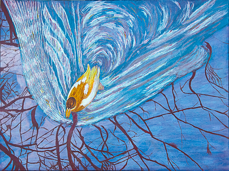
My latest opus, a duck rushing along the river during mating season:
Oil painting is pretty exciting for me. Unlike a professional, I never quite know where I will go next or what will serendipously happen next. For example, at first, my duck made its first appearance in lemon yellow with its head surrounded by a white line. Musing on the duck head for a couple of days, my gut feeling was that it must be strengthened with a coat of raw umber. Also, feeling that some harmony had to be created between the still and the churned up water, I remembered that Karl once told me that a glaze with, for example, raw sienna, could smooth out differences in painting style. Whereupon, using Skype, I called Haarlem and reached Hanneke who kindly explained to me about glazing.
I decided to mix Ultramarine blue and Quinacrine red to make dark purple and then, taking all my courage, I applied that dark mixture to my painting. Beginning to wipe off some of the purple, I discovered that white streaks, done by mixing Titanium White with viscous linseed oil did not take on the glaze while the more porous area done by mixing paint with thin linseed oil did. Happily, every step that I take results in a small, new discovery, many of which I probably could have anticipated with some thinking.
Another surprise yesterday concerned the naming of oil paints. Reading about pigment information of my Winsor & Newton oil paints on dickblick.com, I learned that the paint sold as ‘Burnt Umber’ consisted of the pigment termed raw sienna while the paint sold as ‘Raw Sienna’ consisted of two pigments termed brown and yellow ochre.
I am prepared for future surprises resulting from my gut feeling, my trying new methods and what the world out there will have in store for me. To educate myself, my friends, I ordered Interactions of Colors by Joseph Albers that you recently talked about.
I saved the duck image for the web and then inspected its color. After I inserted the image into my post, the colors changed, they became somewhat brighter – the turquoise and blue were enhanced. Do you have the same problem inserted color images?


Wow I like it! A lot!
Birgit
Must say that I just love these paintings you’re doing.
Birgit,
That duck is a lot more colorful than he was last time. The tinge of fantasy/surreal in your paintings reminds me of Angela’s, I can see why it appeals to her. Here I think it’s due to the oddity of the down-swimming duck gliding over the trees (in reflection).
I’m not sure how much practical help you’ll get from Albers, but hopefully it will be stimulating. The place I’d go on the web for learning about color, as well as other elements of painting is Bruce MacEvoy’s watercolor pages. He addresses the relation to oils and other questions on his FAQ page. There’s a ton of material there, nicely written and with lots of cross references.
Color images on the web are notoriously difficult to get right, and in fact, every monitor will show them differently, unless calibrated–something few do, probably mostly photographers, who have nothing else to print from.
Birgit:
A quick question: the wake of the duck disturbs the reflections of the branches – except at one point where foliage and fowl are conjoined. It appears as one of those decisions that one must make in working out the composition. Did you try it without that feature?
Thank you, Angela
Jay, ‘one point where foliage and fowl are conjoined’, it does look odd in the painting; seemingly, the duck is suspended from the tree. In the photograph, see Steve’s link, that branch is remarkably clear but not as clear as in my painting. Will think about that.
Steve,
I desaturated the green head of the Mallard duck in the photograph that you linked too, it seemed too corny. The green also did not fit into the painting here where the colors, as June put it once, were ‘pushed’. Thanks for the Bruce MacEvoy link.
Birgit:
Went back and it appears that the reflection of the branch is on a general line with the surface/eye angle, which is at a rough right angle to the propagation of the wave. Happens to me sometimes when swimming.
Jay,
You are more perceptive about water than I am. Much to learn!
B.
This painting beautifully captures (and shares) your passionate appreciation of the natural world. I especially like how the water reflects the swirling drive of Mating in early Spring.
Thanks, D.
Jay,
Apropos
’ the wake of the duck disturbs the reflections of the branches’
reminds me of your comment (#1) regarding Van Gogh painting ‘Two Women Crossing the Fields’ shown in my ‘June 2007 post’
“Interesting the perspectives in this painting: the planted rows ahead of the figures recede in an orderly fashion, while those in the wake of the figures are a jumble. Makes me think of the turbulence in the wake of a boat or airplane”
Birgit:
Did Van Gogh ever do ducks?
Jay,
No, but there are imitators that did.
I think that my duck is better. I may have remembered about your comment because, thinking about how to improve an earlier, more yellow appearance of my duck, masking in its front, its rear end reminded me of van Gogh colors and strokes.
Birgit:
That picture is a hoot.
The ducky Van Gogh reminds me of Leslie’s Hello Kitty (more recent work is on her web site), opening June 27 at The Curator’s Office gallery in DC.