Keystoning or the distortion of vertical lines was a concern last year when I photographed paintings. On dpreview.com, I learned that to avoid keystoning one should hold the camera on a parallel plane to a painting and then shoot at the longest zoom setting.

However, this summer, I blithely rotated the camera on the ballhead of my new tripod whose three-legged presence felt strangely comforting in the solitude of the dunes. Most of my recent images of the dunes were shot pointing the camera downwards.
One of my goals is to capture the steepness of the dunes. But, so far, I have failed to image the dunes at their steepest slope as shown by my recent post Fall-off.

I have come to terms with the problems of my slope photography – human frailty. Fear had prevented me from stepping close to the edge of 450 feet elevations consisting of loose sand and gravel.
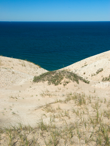
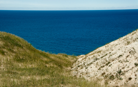
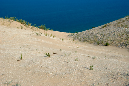
The images selected for today were shot at a safe distance from the Fall-off, again pointing my camera downwards.
Are you concerned about the keystoning issue when you do nature photography?
Do I make downward slopes appear steeper by pointing my camera downwards and shooting at a wide angle?
Do you do perspective crops in Adobe Photoshop of nature photographs?

Having recently been facing the same fear I found myself pointing down and using people way far down as a visual to demonstrate the 450 feet slope. I really like the depth of the blue water and the sand contrast. Once here in New Mexico I wanted to get right out on a edge and ended up wrapping a rope around my waist and tied it to a rock …false security I’m sure but it got me out on the edge and a great photo of chimney rock from above. I love your exploration and courage. Post on!!
Birgit, one thing I can suggest to make your slopes appear steeper is to make use of timing. Specifically, if you shoot when the sun is low, either in early morning or late in the day, some of your dunes will be cast in shadow, and others will be catching light. That can help a lot to convey dimension. The thing that’s flattening out your dune photos is the even mid-day lighting.
When photographing paintings there are a few tricks I’ve learned to keep things square. When I hang the painting on the wall, I find the center of it with a tape measure. Then I bring my tripod over next to it and set the height so that the center of my lens is at exactly the same height as the center of the artwork. I also have a tape line on the floor of my studio (when I have a studio), that runs perpendicular to the wall the artwork hangs on. I try to center my artwork above that line, and have the camera set up along it. So with these two simple techniques, I’m able to have the camera lens, at any distance from the wall, lined up precisely with the center of the painting, both vertically and horizontally.
My digital camera has a setting that will display a grid in the viewfinder. That’s also a great help. And when I get the images into Photoshop, I use the crop tool to make the alignment perfect. But it’s usually pretty close to begin with. When I shoot slides I don’t have the Photoshop option, so lining up the camera is when it all happens.
Thanks, David, for the advice.
The dune shots ‘Fall-off’ were done in the morning soon after the sun illuminated the western slopes. Next time, I will take pictures in the late afternoon to avoid the flat lighting.
Birgit,
David’s advice seems sound to me, although it means being onsite early or late, which is anathema to my aged body and lazy soul.
That said, the shapes in these photographs, combined with the color (or are the shapes just color or vis-versa?) are glorious. The simplicity and the lack of shadows turns them from photographs to abstract paintings (this is meant as a compliment….)
The first photo, with the little grassy mound front center, seems very sexy to me and once I thought that, the second one took on lovely connotations along the same line. The third doesn’t resonate sexuality but the overlapping diagons work well.
Do go out at dawn (which is after all getting to be a bit later) or dusk and then let us see comparisons.
Birgit:
I have experimented around with it. Since the introduction of images in a comment seems beyond my meager abilities, I’ll e-mail you one or two.
June,
I was hoping that you would share my feelings about pictures 1 and 2.
Picture 3 is the favorite of Troels. He wants me to try to make a wall hanging of the motif. Lots of stuff to look forward to.
June,
“…first photo, with the little grassy mound front center, seems very sexy to me…”
I had the same immediate response but I was also contemplating Male Gaze and frankly, the hairy chest…
Birgit, I don’t know much about photography, but Photo one was a real eye catcher. My first thought was that of a female body, and it took me a second to realize what I was really looking.
D.
The hairy chest is the extra twist preventing the picture from being too blatant.
June,
I have been thinking about your comment that the lack of shadow makes the photo look abstract. Interesting thought.
Can’t say I’ve had the keystoning problem with nature photos but definitely with houses :-)
That first shot, wow! I had to laugh when I first saw it, it’s just so evocative!
I’m wondering if vertical shots will create a greater sense of height?
Birgit,
Like June, I like the abstract look and the colors. If you take David’s advice, then depending on the lighting and how deep you make the shadows, you might either get a more complex abstract with dark shadow areas, or a more 3-D realistic depiction, with graded shadows revealing the form of the dunes. That may help with an impression of depth or distance. Even more helpful in that regard would be providing a close foreground object (or objects), possibly with similar objects (stones, people?) in the distance. The difference in size between foreground and background will emphasize the geometry of your space. For example, imagine a boardwalk and stairs receding down the slope; that would be an extreme case.
I’m not sure my last comment made sense. It seems the vertical photo implies the height of the dune and the inevitable drop while the horizontal shots do not.
Birgit:
Hitch up me britches and weigh in here. I copied picture one and tried running it through the perspective tool a couple of times. The dune scape just refused to tilt downward. But it helped if I got rid of the sky line, leaving just the water. Yes, me and the sky again.
Jay,
The pictures today were taken at some distance to the edge. Pictures 1 and 3 of Fall-off and the photo of my daydreaming sister attempt to show the slope of the dune.
Steve,
I am looking at a photo that Ginger emailed me taken at a popular place where the dune slope is more user friendly allowing people to descend. She did what you suggested, using people as perspective cues.
Finding perspective cues where the ‘Run-off’ and ‘Fall-off’ photos were taken is difficult. There are no boardwalks and no other people , unless I bring them with me. My penchant for being off the beaten track.
During early morning hours shadows are very black against the glare of the summer sun on this high plateau. Will keep checking it out during other weather conditions.
I have learned from these comments: Flat versus 3-D.
Tree and Jay,
I have been confusing: Vertical versus Horizontal, Fall-offs versus Run-offs.
The confusion was fruitful because you all have helped me to understand more about what I am doing.
David,
Your advice on photographing paintings is a keeper. I will try it. I have always had a problem with keystoning and in the process of cropping, I would delete some parts of the painting in order to make the ends look complete. It looks like the technique you mentioned will help me.