We have been discussing the correction of distortions that can arise when photographing paintings, doorways and such. One solution is found in Photoshop where a mode in the cropping tool can be used to square up images taken from oblique angles.
This mode, meant primarily to rectify, can also be used to distort. That which is already head-on can be given an oblique perspective.
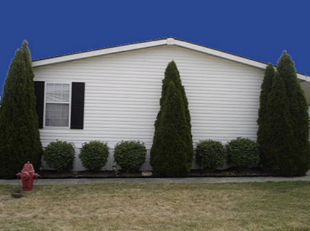
This is an example using one of Tree’s houses. Here we see the image as she posted it.

I applied the perspective tool, cropping extensively on the right-hand side, but not on the left. I clicked on the image and the program made its corrections. Instead of straight on, the view is now oblique. Note that, while the clapboard takes on a nice sense of perspective, the bushes become a sort of hybrid. It’s almost as though they are cardboard cutouts arranged along the sidewalk. This can be seen as another potential topic in the long discussion about depth and flatness in art.

Your browser may not support display of this image.
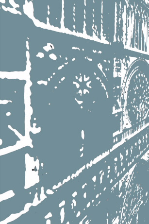
This capability has been handy for manipulating stock images. The next example is a modification of a head-on shot of Notre Dame Cathedral taken from across the plaza. By changing the perspective I found myself hovering where few have been, near the façade and a hundred feet or more in the air.

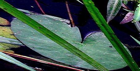
These are other examples where I have moved in for a frog’s eye view of some lily pads.


In adjusting the perspective, the surface of the water becomes a spatially fluid thing and the plants lose their accustomed relationships. Pity the frog.
What ideas would you have for this?

Jay,
Very interesting about the induced flatness when the geometry of converging lines conflicts with what you can actually see (bushes from the fron, not the side). A little bit of this “something off” effect could be good for some purposes. And it’s also fascinating how it causes a transition towards abstract with the lily pads. It’s least noticeable with a flat graphic like the Notre Dame, which is very effective.
Steve:
In fact, I’ve tried it with group photos and the faces that are “nearer” take on an ambiguity: they are both flat and pushing toward you like something in a 3D movie. It’s provocative, but could easily be overused.
The cathedral facade is a near perfect subject.
I would point out that the perspective function works both across and up and down. The last lily pad picture actually has the water surface canted. I did that by shaping the perspective bounding box into a trapezoid. One can distorted by repeated stages until a desired result comes up. For me, however, it hasn’t been a matter of desired results, but more a “what the…?”.
I’m reminded of silly putty. Remember laying it flat on color comics and imprinting?
Monet would probably enjoy your experiments! I like the lily pad photos, they’re very anti-natural. Not sure that’s a word but it works for me.
Ah, Jay, now I see how you achieve your imagery. Jay taught me to correct my keystoned studio photos, but I never played with the process. Fixing the studio photos with the perspective function was miraculous — and doesn’t distort too badly when I’m working with distant landscapes.
“Flatness” is one of those attributes of abstract work that had a big vogue for a while. Probably it was a version of “anti-natural” — a great word for the revulsion that the abstract expressionists had for images of nature.
Tree:
Ah yes,silly putty. It will be forever associated with slinkys in my mind. Maybe Photoshop has some stashed away in the program, to be brought out when somebody begins to mess around with the perspective function.
It would take a while just to bring Monet up to date as he died at the very outset of the electronic age. If still alive, he would most likely prohibit me and my infernal gadgets from getting anywhere near his plants.
June:
I must admit to using it on occasion, primarily when doing a map painting. It allows a person to transform a map into a kind of terrain upon which one sees diagonally from a given height. I always enjoy the words and symbols dwindling away into the distance.
Jay,
It is great with flying birds
Birgit:
Can you e-mail me an example?
Nice illustration of perspective effects. One thing to try would be to cut the images apart before applying the perspective, so that different degrees of stretch could be applied to different depth planes.
Karl, that’s a very astute suggestion. It’s the way we create matte (background) paintings for films from photo elements.
We place things on multiple planes (as layers), parallel to the picure plane and progressing back in space. Each plane has its own requirements to work visually. In the examples above, the trees and shrubs (and the fire hydrant) would be copied to different layers, and while they would change in size and location, their orientations to the viewer would probably not change much from the original. This would also involve a certain amount of cloning the background, so that it’s continuous behind the newly-placed foreground elements. And there would have to be attention to the edges of the cutout elements (best done with layer masks).
At a certain point, some photographers may feel that this gets pretty far from pure photography, which it does. But for painters using Photoshop as an image-manipulation tool these are common techniques.
David,
I was watching Perfume on a DVD and I thought I noticed a lot of “applied” perspective. It seemed somehow not quite “real”. Based on your comment above, I think I understand what was going on. I kinda wish I was in the movie business also!
I kinda wish I was in the movie business also!
Karl, be careful what you wish for! I’ve been working 6 days a week, 10 hours a day, for months on a silly zombie movie. Haven’t had much time to do my own work. I’m in the process of exploring other ways to make a living.
David,
Be careful what you wish for also!
Silly zombie movie, hey, careful what you say in public! Maybe you don’t get the subtle aspects of it. They say death in art will be big this year, so probing the afterlife or un-dead state may be quite on the mark.
What about that zombie-bat painting you are supposed to be making?
They say death in art will be big this year…
Hopefully that death won’t occur at the box office.
What about that zombie-bat painting you are supposed to be making?
I’m taking your earlier suggestion and only working on commission. Still waiting for the check to arrive…
Guys:
Mulling over your comments, which means I’ve been madly going through the Photoshop users guide.
I, myself have wished for a crop box in which all of the handles are independently maneuverable. And, while wishing, that new ones could be generated where needed. I suppose the computations arising from such generosity would either over tax the computer and or one’s patience.
There are grungy ways of doing things, like duplicating the image, distorting cropped portions of each, saving each image, and reassembling them in Illustrator. But, oh, how longed for is an easier way.
I also ran across a way to divide the image into separate segments – each independently workable. But I can no longer remember where or when.
Jay, If you’re looking for a way to move the handles independently with the crop tool (for the whole image), just click the perspective box up in the tool bar. You can then move any of the four corners wherever you want them.
If you’re trying to distort part of an image, what you want is the Free Transform tool. First either select the part of the image you want to manipulate using any selection tool, or (better yet) select it and copy it to a new layer (Layer>New>Layer via Copy). Then go to Edit>Free transform. Once in that mode you can do all sorts of things to the element (the whole layer, or a selected part of it), including, by holding down the Ctrl key (Windows/ probably a different key for Mac), moving any of the handles independently.
David:
Thanks. I should have been a little more specific – I really was alluding to handles situated in other places besides the corners.
Yes, Photoshop users guide did talk about the free transform tool, but I blew it off. Will now go back for a closer look.
Jay, the Free Transform tool should allow you to do more than you probably even want to do to alter the image. You can scale, distort, rotate, and flip the element. You can put it into perspective. There’s a warp function that allows you to distort the image based on an overlying mesh. By selecting the part of the image you want to change and copying it to a new layer (see comment above), you keep a lot of options open.
Once you’ve got the element in Free Transform mode, you can access those functions I mentioned by choosing them from Edit>Transform. The trick is to make all the transformations you need while leaving it in that mode, and then hitting Accept or Return when you’re done. Whenever you mess with an image you get a certain amount of image degradation. So if you were to do each of those things separately, the image could get pretty soft. By staying in Free Transform mode the whole time, Photoshop treats all of the changes as one transformation, so the image retains a lot more clarity.
Anyway, that’s probably a lot more techno stuff than you want to know, but it’s a really useful tool.
David:
Actually, I had looked at it. I tried – or thought I had – the functions that you mention, without achieving any trapezoidal distortions. Perhaps this version of Photoshop doesn’t support the effect I’m looking for. However, I have had the experience of returning to something after a good night’s sleep, to find success where there had been but failure before.
David,
Thanks a million for the ‘Free Transform Mode’ introduction.
…trapezoidal distortions. Perhaps this version of Photoshop doesn’t support the effect I’m looking for.
Jay, I’m using CS2, but most of the functions I’ve described have been around for awhile (I think the warp function is new).
To move the corner points independently, when you’re in Free Transform mode, you have to hold down a modifier key. On Windows it’s the “Ctrl” key. I don’t remember which one it is on the Mac, but there are only a few to choose from. (I’m on Windows all day at work, and a Mac at home. It’s a constant source of confusion, but it keeps me on my toes).
The alternative to using a modifier key is, while you’re still in Free Transform mode, go back up to the Edit menu, and from “Transform” pick the type of transformation you want to do. You’ll have to experiment to get used to what they each do. You can keep switching from one function to the other this way, all while you’re in Free Trasnsform, and do pretty much any combination of things you want to the element.
Have fun!
—
Birgit, my pleasure…
David:
Yes! I did as you said: and I did, and I did. It was wonderful! I turned Notre Dame into a pretzel, and that wasn’t all.
Good going Jay! I hope it’s one of those hot soft pretzels like they sell on the streets in NYC :)
David:
It was more like a baguette.
I could swear that I had a hot soft pretzel in Santa Monica.