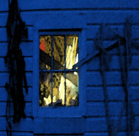
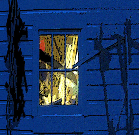
In response to Birgit I went back to the original post in an attempt to temper the blur. Birgit has come to accept, perhaps embrace, the blurriness, while I have gone in the other direction. I tried the sharpening and blurring tools with unsatisfactory results and turned to the old standbys, poster and watercolor, in the artistic filters.

This is the image posterized. It’s alright but has lost the softness of the original.

This is watercolored and has the usual silk screened look. The view through the window has gone flat.
This is it now; time to declare the first post the winner – or perhaps the least loser.

Jay,
I selected your ‘water-colored’ window and pasted it onto the original. It did not work. Even the inside of the window (yellow and red) looks better to me somewhat unfocused as it is in the original.
The bright yellow captures the attention. Its hazy outlines introduces mystery. Thanks for this experiment. I will put this finding into my memory bank.
Did you people read about the brain power that comes with aging? http://www.iht.com/articles/2008/05/20/healthscience/snold.php
Birgit:
The problem is that I’ve forgotten how smart I might have been.
As kind of a closing statement let me say that the watercolor version represents more a full moon on a clear night than it does the soft light of a gloaming.
Jay I like the first photo best even though is blurred you can still feel the warmth of the room against the ambiguous blue. It provokes a sense of security to be welcoming inside…
Try selecting each pane carefully and applying a mild gaussian blur to the colors inside the window. Deselect and try some other filters with the if you still feel it needs something. Taking the sharp edge off of the bright colors ties it together and makes it feel more dreamy
David:
I followed your suggestion, not expecting much – as I had tried using the blur tool in a like manner earlier. This time around I sequestered the panes with the polygonal lasso tool and stepped on the Gauss a little. I did this in the posterizing version and it came out better. Thanks for the tip.