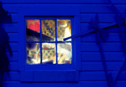
You Gloaming commentators have done a splendid job as com-mentors.
The right combination of detail, color and air seems to be at issue. In this version I have blurred the contents of the window, lightened the blues and have shown more of the right wall hanging. The left hanging cannot be retrieved without going back to the raw image. If, however, it is missed, then I’ll go back. That would be O.K. as one of my new year’s resolutions was to persevere.

?

Jay,
Using photoshop, I pasted the original and present images side by side to be able to compare the two more easily.
I still like the original better:
(1) The blue is more greyish and its yellow is more lemony. I wonder whether the fact that the blue wall is slightly unfocused helps the somewhat nightmarish impression.
(2) I am enamored by the stuff hanging to the left of the window. It reminds me of cowboy times. The blue on far left helps framing, emphasizing it.
(3) I prefer the window in its more elongated form.
To me, it seems that the original Cotwoldish interpretation of your workshop at gloaming is perfect.
Birgit’s eye and I agree. I don’t know what Jay may say, but his efforts have illuminated what we find appealing. One reason I seldom work with color (for now, anyway) is that even slight differences in hue can greatly alter the impression, and I can dither indefinitely trying to get it the way I want.
I wonder (it’s the editor in me)… could this just-blurry-enough window be stretched to fit and then cut-and-pasted into the original wall?
Melanie:
In principle, yes. I’ve been avoiding that as I’m skeptical about the outcome. But since we’re playing around here I might give it a try.
Melanie:
Looks like Birgit did it for me.