Leaves are beginning to come out here now, but branches were quite bare a week ago when I payed a visit to the strip of woods along Sourdough Trail. I’ve gone there occasionally through the winter, but much less frequently than I used to while actively engaged in that project (I never closed the books on it, but I’ve done very little in the last year). I’m thinking seriously of re-activating it. In any case, the new season seemed to call for a little experimentation.

One of my ongoing concerns in this series has been dealing with complexity. Not only is there a lot of detail in the woods, but the strong light/dark contrast–especially on sunny days–brings out and emphasizes that detail. I have mostly thought of the complexity as a visual issue. I tend to like all-over pictures à la Jackson Pollock, especially as it tends to subvert the common advice to have a single clear subject. (I’m not saying the advice is necessarily bad.) Regardless, it seems that some level of organization or order, however hard it might be to articulate, is necessary for a picture to hold our interest.

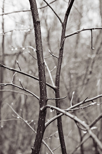
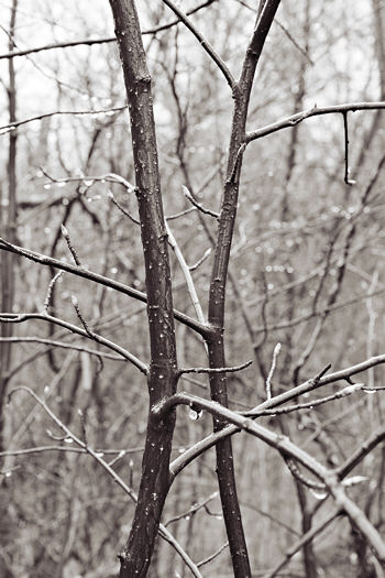
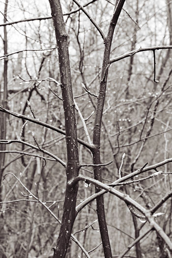
For there to be a subject or figure, there must be separation from the (back)ground (and/or foreground, if the subject itself isn’t there). There are many ways to achieve this, even for photographers. But from a given position, if one can’t alter the llighting, about the only recourse is to control depth of field, i.e. the range of distance over which objects appear in focus. I find it hard to judge on the spot what will work best, hence my little experiment on these nearly touching saplings. In the successive images through this post I have used increasing depth of field (diminishing aperture).

While “working up” the results this morning, I realized that there may be a more general and more meaningful aspect to the complexity issue. These images are literally views of the world, albeit a humble corner of it. How simple or complex do we think our world is, or want it to be?

Which version appeals most to you? Do you think it bears any relation to your personal vision of the world, or is that just philosophical blather?

Steve,
Because I can’t see all four versions side-by-side, I have trouble comparing them. But your general consideration — how to deal with foliage — its complexity of line and light — is interesting both as a craft question and as a philosophical one.
First, I think this is a matter of what you are trying to say — what visual ideas you, as artist, want to have us focus on. So it isn’t a matter of appeal but rather a matter of your mind-set.
Having said that, I can also confuse the issue further by talking about my own mindset this morning.
I like _making_ the complexities — the crisscrossing of visual ideas that under-and-over-lay each other. I think my world/mind works like that, so it’s fun to make the art reflect that sense. And yet there are times when it’s all too much and what I want is the simplicity of focus and clarity, both in life and in visuals. In my head, there’s the joy of making which sometimes contradicts the desires of seeing.
Which is to say that, this morning, clarity of foreground (#1) seems a bit more appealing — or maybe, when I keep looking and looking again — I like the contrast between #1 and #4.
And looking again, I have to say that #4 is still quite clear in its value contrasts, regardless of the depth of field. And there’s something wonderful in all the linear “stuff” that lies just behind the foreground.
Maybe it isn’t the philosophical mind-set of complexity but rather, what one wants to see at any given time. #1 of your photos gives us the strength of knowingness — we can “know” those twigs. #4 gives us the strength of mystery — there’s things to see beyond the obvious that beckon us but can’t quite be clarified. (I’m thinking of Birgit’s paths, too, although the techniques are not at all similar). Of course, the intermediate stages have their own mysteries, but given the confusion of foliage that lies behind, I like the strongest representation of it.
I am not much interested in the intermediate stages, although I can imagine myself finding them most important. For me, it’s really a matter of what I “need” visually at any given moment — or sometimes what insights I can gain from other people’s visions.
So, what you want to talk about within the photograph is your decision, but it isn’t irrevocable — what you want to say this time may not be the same next time. And what you want to say may not be what I need to hear just at this moment. It’s what makes it all so fascinating.
June,
It is hard to distinguish easily using visual memory. I first tried making the images small enough to fit two horizontally, but the out-of-focus parts look less so at that size. If you want, you can compare side-by-side by opening a second browser window and overlapping the first.
What I “want to say” is not so clear yet, which is why I chose this image to illustrate the issue. Or rather, I want to say both that here’s an interesting pair of saplings entangling and they’re here entangled in an interesting patch of woods. That balances out to a preference for #2 or #3–at the moment. With modern digital picture frames, perhaps I could create a mood-sensitive version that would adapt to the viewer via face recognition software…
Steve,
This puts me in mind of that very famous painting by Mondrian — the name of which escapes me, of course — of black and white bars framed in a circle. Reminded of that, I have a preference for version 3 because of the tension the balance creates between foreground and background. My perception shimmers back and forth so that, as in the Mondrian, it’s difficult to determine which is hither and which yon (which was, if I recall the chat label from the exhibition correctly, his intention).
Your experiment with depth of field reminds me also of June’s question: “What place do stories, a medium based on time, have to do with canvas and paint, a medium based on a single sweeping moment, anyway?” and of the recent exchange (prompted, I think, by Jay) about the presence of time in art. It seems that the content and texture of a “single sweeping moment” is malleable through these experiments in the mechanics of media.
One of the many distinctions between word-pictures and picture-pictures, is that since word reception is linear in time, one word-step at a time, an author has the ability to coax the reader or auditor along by pacing complexity, starting with simpler ideas or expressions of ideas and laying information in courses, like brickwork, until there is a whole great big something or another. A reader and, sometimes, an auditor can halt the forward progress at any time, and go back or forth within the work to ensure her/his understanding. But all the components of an image are simultaneous in time, they come at you all at once, and the viewer’s task is to suspend (that is, prolong) the now of receiving the whole in order to engage with the parts, to — as it were — go back in time to parse the components. [talk about philosophical blather — I think I’ve outdone myself… Must go eat cookies…]
I like June’s analysis of 1 and 4.
The way that I presently feel, I enjoy the twins in figure 1, with their happy bending towards one another, exchanging pleasantries.
Figure 4, makes me I sigh because it seems like a lot of work to make my way through all that brush.
Thus, at the moment Figure 4 makes me feel bad while Figure 1 gives me joy. I will look at the pictures again when I feel less burned out to determine whether my likings are subject to the way I feel.
It is odd that the white pimples on the twins are much more prominent in 4 than in 1. Is the perception of an apparent higher contrast in 4 a feature of the visual system?
Steve,
I really don’t like one better than the others. Which one do you prefer?
melanie,
I was just thinking about my response to D. and deciding for #3 myself, though that’s provisional. When I have a choice, I often like to live with a picture and see how well it lasts. “Tension” is a good word, although I was thinking to myself in terms of “balance” of foreground and background. But there is a push-pull operating there that I would like to be more dynamic than static. As Birgit, says, #4 feels too obstructing. #1 has, I suspect, a more immediate appeal for most people, including me, but then I rather quickly start thinking of it as cliché; it’s prettier, but doesn’t hold my interest as long.
You’re quite right to bring up time and linearity and the contrast between reading and viewing, story and scene. I think I agree with you about #3 precisely because it does introduce enough of a movement between foreground and background to develop a bit of story, rather than being everything-all-at-once like #4 (I exaggerate a bit) or only-the-central-subject like #1.
Birgit,
I believe you’re right about the white spots; all images had the same processing, but the exposures must have been slightly different. But what’s more noticeable to me–now that you prompt me to examine closely–is that the water droplets on the left are much more prominent in #1, as they don’t have to compete with other background detail as in #4.
D.,
Though I’d go with #3 if I were to print one right now, I actually like all of them, and in fact I like them more the more I look at them (though I’m not claiming any is a great photograph). If I were to choose one for a book or a show, it would depend on what else would accompany it.
Steve:
Good provocative post!
I, too, go for #3. I have my reasons for so thinking, but I’m having a hard time explaining. Maybe it has something to do with Cartier-Bresson. Everything in his photographs is both in optical and topical focus. Your #3 sacrifices a little background specificity to better emphasize the foreground interaction, and I can accept that. #4 tends to bury the foreground in a sea of information.
There is something here that reminds me of the business end of the Tevatron, or a diagram of particle interactions where there is a defined event among almosts.
I remember an exhibit of photographs in which the artist had gone out in the brush with the ability to select focal planes. Foregrounds were sometimes blurry with something rather far-off being crisp. It appeared that he could tilt his lens relative to the film or sensor plane as focus often took off at angles. All this to wonder how your loving saplings would appear if in a kind of pool of focus, sandwiched between relatively blurred fore- and backgrounds. They seem to be having a private moment together which might better be spied-upon than frontally confronted.
Jay,
As a former physicist, I have to appreciate your seeing particle tracks here, complete with trajectories of sub-particles cast aside.
I did make some photographs as you suggest, with blurred foreground as well as background, but none of such suggestive subjects. In fact, I didn’t think of the allusion to human figures until working with the images on the computer.
Steve:
And the background plants share, as observers, in the overall imputed person hood of our foreground pair. Image #3 recognizes their participation without getting into their personal space as #4 would tend to suggest.
Jay, you’re our Kant: first time, now space. If I had a view camera like the photographer you alluded to (comment #7), I could make our couple warp their space like a pair of black holes. I’m not quite sure how that should look, but perhaps the Large Hadron Collider will provide us an opportunity to find out.