In Praise of Trees is the name of my show with printmaker Kerry Corcoran, which opened about a week ago at the Bozeman Public Library. The Atrium Gallery is essentially the combined entrance halls from two sides of the new (environmentally-certified) building, resulting in a broad, L-shaped space intended for exhibitions. It does get lots of traffic, though much of it under 12 years old. We applied and were accepted over a year ago.
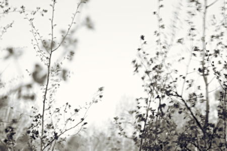
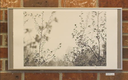
The show is composed of interleaved groups of my photographs and Kerry’s prints. My contributions came from the Sourdough Trail project, the Cottonwoods series, and the Meeting Sky series, together with a newer set, unimaginatively called Windy Day. The latter consisted of the image above in a constellation with the following six, which are actually details of the same scene photographed at different moments.
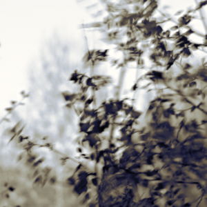
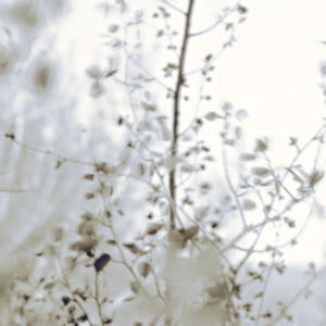
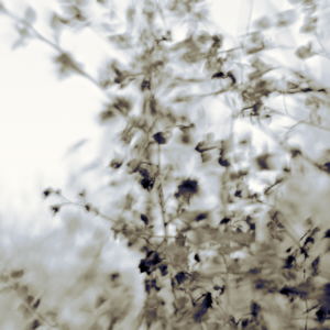
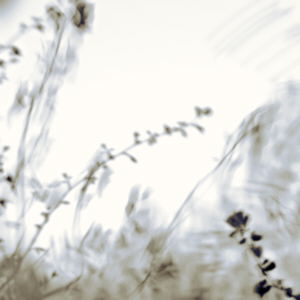
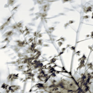
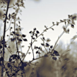
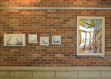
These were strung out in a wavy line against the color-contrasting, warm brick. The large picture is 22″×13″, while the smaller ones are 9″×9″.
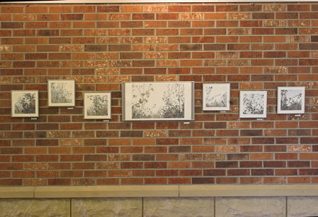
Windy Day set
Some of Kerry’s prints are quite large, and certainly dominate my photographs in terms of size. However, I don’t think the viewer’s experience is quite so lop-sided. What’s your impression?
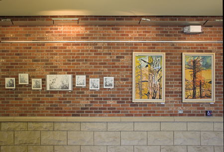
Windy Day next to Anam Cara and Wilderness
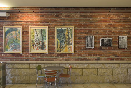
Along Sourdough Trail (3 of 5) next to Tilt series
One of Kerry’s sets consisted of three grids of 9″×12″ prints sandwiched between layers of plexiglas, each depicting the same tree in front of a friend’s house, but (loosely) in morning, midday and evening light.
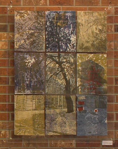
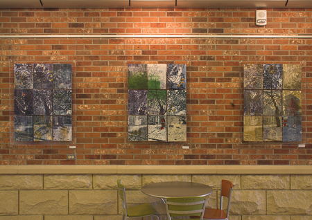
Composite prints by Kerry Corcoran
For this show I experimented with papers. My Windy Day and Meeting Sky sets were printed on tones (“white” and “cream”, the latter actually closer to pale peach) of a watercolor/printing paper (Stonehenge). This took some experimentation with inking profiles, and yielded less sharpness and contrast than normal photo printing paper, but that seemed appropriate. I also chose not to use glass in the rather minimalist frames, and even exposed the rough edges of the paper on two sides.
Framing with exposed deckle edge
The absence of glass not only made the paper more present, but avoided reflections, which I always find quite annoying. Hopefully the paper will stand up well, without warping significantly. It’s not so much of a risk with photographs—I can print a new one if need be.
Reflections on glass, not on paper
As I’m writing this, Birgit has posted a comment on our earlier discussions of dissolving boundaries in Giorgio Morandi’s paintings. Though not quite explicit, that idea was certainly in my head with the later work in this show. The complexity of the tree/sky boundary in Meeting Sky, with the densely ramified twigs, and the softness of it in Windy Day, with the motion blur, are two ways this idea can be approached in photography.

Steve:
Good show! Your work with movement, plant or animal, comes across as so natural. The two of you complement each other thematically. But Kerry’s pieces are quite big, busy and bright, while yours invite a more contemplative response. How does that work out in situ as the installation shots suggest a bit of a mismatch?
Jay,
It’s interesting that Kerry’s pieces come across as busy and full, whereas there is technically more detail in at least my conventional black and white photographs. One can go as close to the photos as one wants and, in places anyway, find detail about as fine as the eye can see (I am, however, at the limits of my camera with these 12″×18″ images). Gratifying the natural tendency to approach that closely is another reason I dispensed with glass.
On the other hand, much of that fine detail seems natural and predictable: we pretty much know how real leaves and twigs look. Kerry’s technique doesn’t allow such fine structures, but the structure there is idiosyncratic, constructed entirely by her, even if inspired by nature. In that sense it may feel like there is “more” to see.
In the end, my rough impression is that people would spend about the same amount of time before a photograph or a print. But it would be nice to observe this more carefully than I’ve done so far.
Steve,
Pure poetry!
The square 9 x 9 format works very well. I also really like how you framed the 22 x 13 picture. The soft contrast is lovely.
Quoting Troels: I really like that!
Troels liked the delicacy of the foliage and the unfocused background. He thought the unfocused background made it mysterious, allowing the viewer to imagine, for example, that it represent something in a city such as the Empire States building.
Steve:
Are the prints dry mounted? Way back in times of yore, one would create a sandwich of backing board, a waxy sort of paper and the photo. This would all be placed in a heated press, designed to weld the whole thing together like a toasted cheese sandwich. Worked or works very well.
I keep going back the third of your square prints. For me it really catches a call-and-response between the air and the plant. Puts me in mind of a series of photos I ran across in my mindless ramblings on the net. The fellow goes or went out to logging sites. It appeared that the camera was on a tripod as the overall scene is steady. In motion is seen a tree in the process of falling and the exposure is long enough to allow the tree to describe a blurry arc. Makes me think of an angry ent.
Birgit,
Glad you liked the Windy Day, I think it does represent one direction I’ll be pursuing as I get back to photographing. Like almost all my work, it goes through a monochrome stage from the moment I start processing, but I end with a (digital) toning step which is increasingly deviating from that obtained by traditional chemical methods (Meeting Sky is close to a sepia or thiocarbamide look, modified by the paper).
Jay,
I’ve never done dry mounting; the press is bulky and a little expensive. I have used Kodak Photo Mount, a spray, for similar applications. Here the paper and backing are held only by the edges of the frame. So far, that’s working out OK, though major humidity changes might cause trouble.
#3 is one of my favoites, too. I have some other images that are more ent-like perhaps, with larger trunks in motion. It wasn’t a terribly strong wind to move these smaller ones.
Steve,
I am attracted to all of your 9 x 9 images, each for a different reason.
It feels good to contemplate the subtle hues of your images after looking at my colorful snow-in-the-dunes. After I did my first and, so far, only wall hanging with brightly colored silks, my plan was to do the next one using undyed sheep wool of different hues, but it never happened, probably for technical reasons. Perhaps, in my current quest, matching different pigments of oil paint, one day, I will mix more subtle hues.
How did you attach your pictures to the brick wall?
Birgit,
I did want the smaller images to have a variety of personalities. Since they are digital, I have the advantage of much easier control of color than I would with a brush and oil paints. On the other hand, effects that rely on gestures, such as the way the shadows on the snow seem to glide across your dune, are easier and freer with a brush. No doubt there is software that would make that pretty easy digitally, as well, but somehow I feel it would be less authentic. As somewhat of a purist by nature, I limit my processing to what seems inherent in the photographic medium–though exactly what that means is a personal interpretation.
All pictures are hung on a thin, twisted wire cable from the metal rail you can see above them on the wall. It’s amazing how unobtrusive the cable is. It’s about 1mm in diameter, and a light silverish gray in color. A small hook can be adjusted to any point along the cable, and the extra cable length tucked up behind the picture.
Steve,
I cannot imagine that, using software to add the shadows, would give the exquisite details that are so compelling in your images.
What kind of printer do you use?
Yes, the sheer quantity of detail is compelling in itself, Nature is a consummate artist: I wouldn’t have the patience, let alone the skill, to draw like that.
My printer is an older model, HP B9180, using high quality pigment inks.
Hi Steve, those photos you posted work great as a group; I sense a profound progression in them.
It’s a bit of a jolt for me to see the colorful prints next to your photos. I feel meditative and calm viewing your works and then, bam, there are the prints!
Congratulations on the show.
Tree,
It is quite a contrast, which I think probably works better to emphasize the different qualities in our two approaches. Did your jolt seem more disconcerting or energizing? How would the effect work going the other direction?
You know Steve, a good move for you would be to upgrade to some kind of 100 megapixel rig and have them throw a really big printer into the bargain. In my mind, your work would do very well at a much larger scale.
I’m thinking of a horse’s head print that would be horse sized.
Jay,
I would certainly have printed these larger (max image size was about 12″×18″) if I’d been able to. That was both a printer limitation, and also a camera one, except for the Windy Day series which had no sharp detail.
The horses, as it happens, are a project I’ve been wanting to return to, and a potential next show.
Steve, at first look it was disconcerting. Coming back again today it is less so. My first thought was that I wouldn’t have done it this way but now I’m reconsidering.
If I had the enjoyable task of hanging this exhibit, I would have liked to see how it would look with yours on one wall and the prints on the opposite wall.
Not a criticism by any stretch, just things I enjoy pondering. I always think this way in museums!
Tree:
You would have fit right in yesterday. Took some more paintings down to my show as a kind of mid tenure refresher. Our efforts in moving things around caught the attention of an onlooker, who began to tender some very good comments. She became something of a unnamed co-conspirator in the project, much to its benefit.
Sounds like fun!
Tree, Jay,
The hanging was the first time we had really brought the pieces together, so it was fun, but also a little unnerving. Setting pictures against the wall on the floor helps, but doesn’t really give the impact of having them properly spaced, and at eye height. We tried to start with major decisions, and didn’t really make any significant once something was up, although I re-ordered some within a couple of my groups. I haven’t shown all of these, by the way; altogether there are three groups of five photographs, and one group of seven.
Tree, that’s a great way to go through museums, thinking of what goes with what. I’m afraid I usually take the placement for granted, and just focus on individual works. That’s perhaps partly because I don’t have any major collections that I visit and revisit.
Steve, some people want to rule the world. I just want to rearrange paintings on museum walls.
Steve, great work, and congratulations on the show! I really love the movement in the photographs. I can totally feel the wind.
Sorry it’s taken me awhile to comment – haven’t been keeping up w/ the blogosphere lately.
Steve,
Gosh, I would have loved to attend that show. I really enjoy your work. “Pure poetry” describes it nicely.
Seeing as I live far away from tees, I’m a little more inclined to praise them than I might have been in days past. They are quite wonderful.