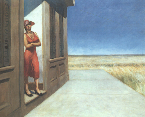
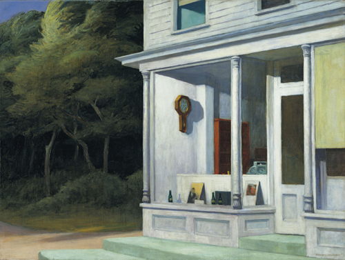
The two paintings of Edward Hopper, shown here, are part of the current exhibition in the Whitney Museum of American Art: Edward Hopper and His Time. Much has been written about Hopper’s usage of light and shadow. I will point out his usage of incongruencies that further accentuates the sense of isolation and alienation that Hopper’s painting are known for.

South Carolina morning (1955; oil on canvas, 30-9/16″ x 40-1/4): A woman stands in the entrance of a building, staring in the direction of the viewer. Her lower body pushes forward while her upper body leans backwards. The voluptuous female form in a bright red dress stands in a marked contrast to the severe pale lines (I don’t remember the color of the house to be as dark brown as shown on this photo downloaded from the web) of the house and its concrete platform against an uninterrupted expanse of grassland. Repeating the V-shaped line of her cleavage between her neck and clavicles accentuates the woman’s vivid physicality. The incongruency of female physicality and arid landscape makes me gasp.

Seven AM (1948; oil on canvas, 30-3/16? x 40-1/8?): This picture shows part of a country store and path, both colored with a kaleidoscope of lovely light pastel hues – green, yellow, blue, purple, pink, lavender and turquoise. Inside the store are a wooden clock and chest, painted in rich brown hues. The straight lines of the country store stand in marked contrast to the crookedness of the tree trunks next to it. These crooked stems are painted in weak grey-brown contrasting with the rich wood colors inside the store. The foliage is a mostly dull green accentuating the luminous pastels of the country store. Together with the difference in the illumination of human habitat and woods, the incongruency of their shapes generates the mood of the picture.
Going into the exhibition, I had been much enamored of Hopper’s paintings. I had always felt, as said somewhere on the web, that Hopper’s ‘ evocative canvases confront the viewer with images of isolation and alienation…’. But after studying his paintings for a few hours today, my sense of isolation mutated into a sense of frustration that this gifted artist would play on my emotions using a formula consisting of light/dark effects and incongruencies. Given a choice between a Hopper and a Morandi, I would choose the latter.

Birgit,
Your analysis seems right on the mark, but your conclusion is the opposite of mine. Morandi works when one is feeling pensive, but I get “mushed” after a while, sinking into his smudges. Hopper’s strong lines against weak landscapes seems to me to be a kind of world view — incongruencies, unconformities, disjunctures — I think Morandi would finally soothe me to sleep whereas Hopper refuses that easy slippage into a meditative state.
To choose between the two would be crazy-making — there are days when I need the mediatation, but there are days when my brain insists on the more true (ah, but what is truth?) edge/formlessness of Hopper.
Thanks for making me think about this. I’m not standing pat on my own ideas, you understand, just maundering through them.
June,
Today, at a bank I saw a reproduction of a Hopper that I liked. It was also a Cape Cod type village scene but without the armselig (pathetic as suggested by google translate does not quite hit the meaning) trees in one of the above pictures. (My mother is just about to arrive from Germany and my mind is practicing German).
Of the Morandi paintings, I only really like the last two that he did because of their dissolving boundaries. I wish that he had lived a longer to pursue that idea further. Perhaps, some day, I pick up where he had to leave of.