I am trying this summer to simplify my productive activities without too much success.
I’m swimming in notions about how to create visual effects, whereas I should be advancing messages. The kit is there, now for more of a narrative.
On the one hand the chandeliers are happy being themselves: it’s the paint application technique that I’ve come up with that’s causing trouble. It produces results easily but, for now somewhat too randomly. I’m trying to harness it’s propensity for doing its own thing by finding things for it to do. Things that tend to be rendered in stone is one approach that I am playing with.

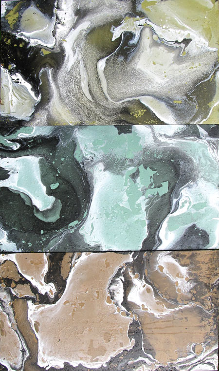
In this instance I have used black, white and green paint. The result I’m getting reminds me of sections of metamorphic rock. The technique is simple, but I’ll leave it to you to guess how it’s done.

Here is a triptych using the same method.

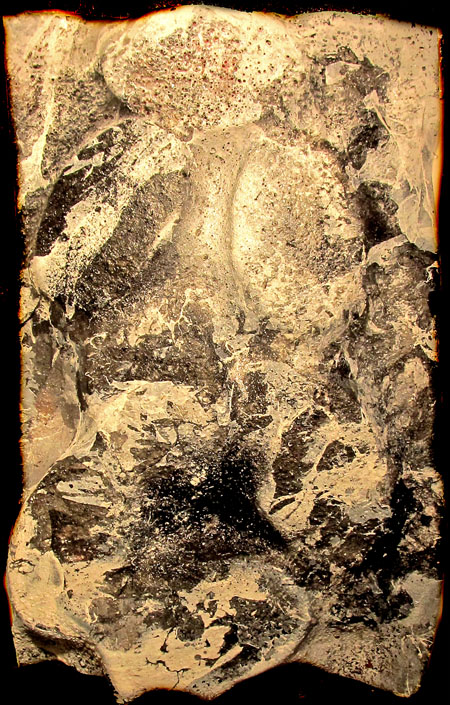
In previous posts I have described the use of heat to slump plexiglass over shapes. Here the slumping was done over a closed chain of oval links. I then applied repeated layers of black and white over the formed surface to get this heavily worked effect. Not surprisingly I have found that the complexity of the paint should be matched with a certain simplicity of design and the other way around.
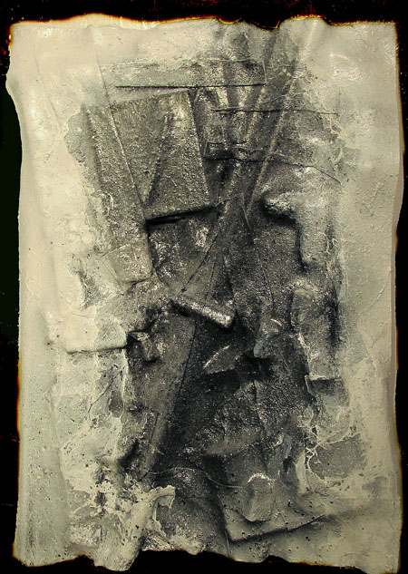
This example below has a more involved underlying texture and I had to cut down on the paint patterns to get it to work.


So what bits of “narrative” are these bringing forth?
Your strength is in your delight in materials and their properties and how the properties can be manipulated. But underlying this is a strong voice; can you make that voice come through the materials?
Oh, and what I didn’t say is I love these forms and the melting, molding shapes. I always have a visceral reaction to the slumping and slithering and folding together of hues and materials.
June:
One line of narrative is constructivist themes: regular forms arranged in some deliberate manner which are then encrusted. I was playing with this sort of thing last year, but primarily to see what the stuff would do. Now I know a little and would proffer to myself the ambition to explore “Plato Meets Plate O’ Spaghetti”. Introducing vivacity into this theme would be a goal.
Another narrative might be “Paint As Bunch Of Cats” as the artist seeks to corral a wayward medium into some semblance of meaningful behavior.
I will surely go back to some of my older themes like city maps and lily pads (give a dog a bone) to see if the now existing tool kit has anything to add to them.
Jay,
The first three piece have ‘organic’ shapes, shapes that are abundant in nature – mountains, rivers, canyons, bones. Marvelous, curved lines that I am addicted to.
Initially, I bemoaned that the last piece shows straight lines and right angles, reminding me of human efforts at carpentry. But then I remembered about crystals, and now I perceive its crystalline sharp angles and I enjoy that piece too.
How can one possibly be an art critic, divorcing one’s natural inclinations, trying to be objective?
Birgit:
You know, as far as I’m concerned there is no objectivity, at least in a scientific sense, in art. Only subjectivity. Nor is there “truth”. I would suppose that a critic might try to practice a kind of three hundred and sixty degree form of subjectivity where one tries not to see things always from one angle. The blind man groping the elephant, and doing so as to cover the entire beast, might not come to an elephantine conclusion in judging the nature of the subject, but would score points for exhaustive research.
Jay,
Could you remind me of your methods?
Birgit:
I have been making the mistake of responding to comments over in Google rather than here, the proper place.
My reply was in effect for you, or anybody, to take a guess and see how close you can come. Allow me to repeat that everything is really simple.
Jay:
Like this?
http://artandperception.com/2009/11/still-here.html
Birgit:
Forgot about that. Now, about the paint….
Jay,
Still have not figured out about the paint.
My grandson is fascinated by your ‘green thing’. It reminds him of a halloween reaper.
It really is an intriguing piece. Looks great from a distance, across the room.
Birgit:
Great to know that your grandson liked it. I might have to frame it.
The green piece and the triptych are using a cheap effect. I have seen that in many paintings. My favorite is the last piece. Perceptually is arousing. It plays a kind of “hide &seek” and coerces me to guess if I have some real objects camouflaged with strips of cleverly cut cloth… “Curved versus vertical” is such an unusual term. It does not fit any logical classification.
Larry:
Have we met?
The green piece and the triptych are cheap as hell. Also, I might add, very quickly boring. But how did I do it?
The last piece also uses the slumping technique: objects placed on the ground and covered with a sheet of plexiglass. The application of heat from a weed burner softens the plastic and causes it to assumes some of the underlying shapes. In this instance, in my haste I had created unsightly holes in the plastic which I attempted to bandage over with pieces of plastic which I essentially glued on with the weed burner. The result comes across as a sort of collage.
Very interesting work! Perhaps an interesting way of making collographic plates?