It seems that I am the only person who wants to use this utility. Allow me, then, to add a few more things that I have been working on.
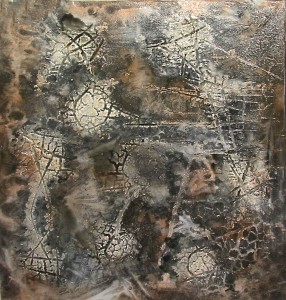
One might refer to these items as baked goods as they represent the application of fire to one form or another of plastic. The first image began as a sheet of expanded polystyrene that was scored with a knife and scorched with a propane weed burner. This process opened the score lines and created checkered patterns which guided my application of paint and varnish.
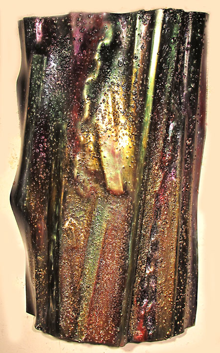
The next is an example of slump molding where a sheet of plexiglass is laid over various objects. Heat from the propane burner causes the plastic to soften and assume the underlying shapes to a degree. This and a few other pieces in this post employ an application of interference paint.
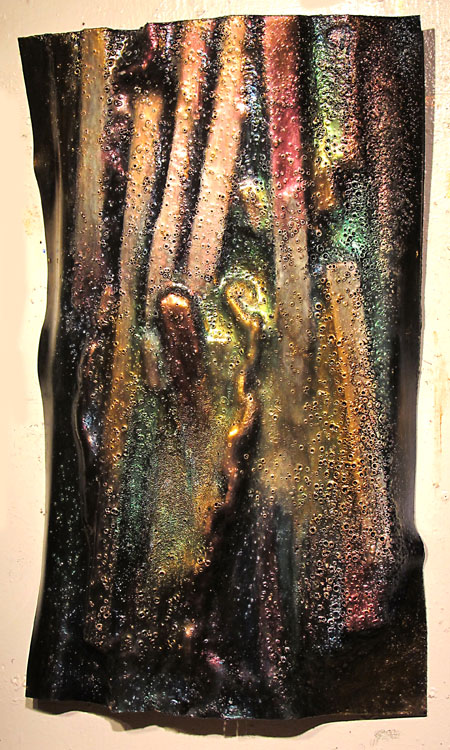
This is a further version of the above composition.
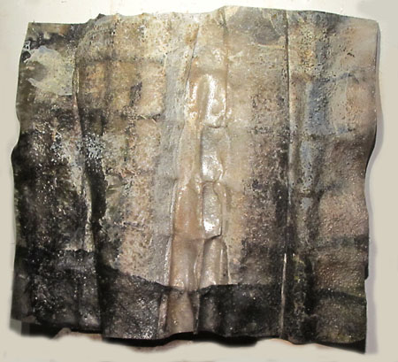
Another slumped plastic object much worked over.
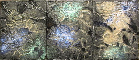
This rather tidy triptych started with the expanded polystyrene upon which a design was painted in tempera. The paint served as a barrier to the flame. I have used common mud to much the same effect. The scored and scabbed surface was then covered in powder which filled crevices. This was fixed with a layer of varnish and highlighted with touches of interference paint.
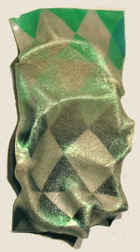
At some point I had painted a checkered pattern on the back of a clear sheet. It was insipid, so I decided to put it to the torch. Some fallen branches served as the underlying forms. Highlighted with interference paint. Note the variation in the surface caused by bubbling of the plastic. I had initially tried to avoid bubbling but came to embrace it as an enriching effect.
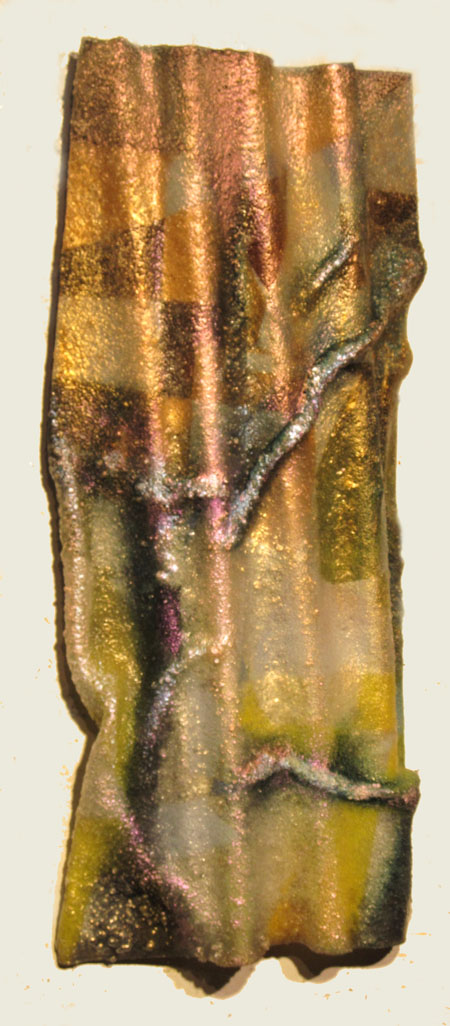
This is another example of a back painted panel that underwent the slump forming process.
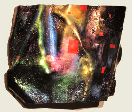
Finally, a rather aggressive example of over painting. I invited my son Bret to add the red additions.

Jay,
You are developing your new art form! I really like the triptych. Its pattern and color complement one another so well. I am partial to the light blue catching my attention and the lesser vivid green. I like the way they play off the muter shades.
The interplay of color and shape remind me of my latest fascination with Lucian Freud. The MET has a room dedicated to his paintings with the addition of a few Francis Bacons. At first, I was repelled by what seemed like a lot of ‘pink flesh’ in Freud’s paintings. But I visit them now once a week, meditating on the ‘landscape’ of the human skin.
I have been a no show on A&P because of my itinerant life style. NYC, then two weeks in Michigan to dissolve my lab, now NYC again but leaving for Germany in a few days. I have not touched a paint brush since August but instead took human figure drawing with Minerva Durham in Soho.
Jay,
like Birgit, I find these fascinating. The light bouncing off the forms, and the use of interference paint in particular, add depth to them. There’s something about taking a stiff piece of plastic and making it look soft and malleable that is thoroughly pleasing — like looking at the fire-molded basalt in geological formations.
I am most fond of the bright plastic stand-alones rather than the triptychs, although they are also fine. I think the stand-alones show that slumping and slurping effect, which is sharpened by the interplay of light and interference paint.
How big are these? Are they wall mounted or yard art? Bret’s addition, the stopping of all the slurping and smoodging nonsense with those emphatic reds makes me laugh. It’s the graphic designer’s revenge.
I’m wondering about “Baked goods” as a concept — goods being an older version of “stuff” and “stuff” being what we are surrounded with in this age of plastics and imagery. Do you have some half-baked goods? Or raw consumptions? The first, forth, and triptych pieces look like ice and snow. Which counters the notion of baking, I think. Or is this like Baked Alaska?
What will you do now that the ice is really upon your neighborhood? Can you do this inside or do you have to resort to some other medium.
I don’t have Birgit’s excuse for not showing anything here. I am playing with an Toshiba Thrive Tablet, but I wouldn’t call what I’m producing “art.” It isn’t very perceptive either….
June:
Oye! I just e-mailed you a fulsome reply without even thinking about putting it here.
I really like the works with the prior geometrically painted surface. It allows the viewer to see the distortions that have been made…..there’s something about them that immediately recall topographic maps. I would love to see more experimentation….
April:
Thank you for your comments. More experimentation is forthcoming as the winter weather abates as this requires the considerable application of heat and must be done in an open space – hopefully free of ice and snow. This time around I intend to plan my work instead of being loose about the whole thing and trusting to chance.