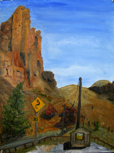
The Clarno Palisades and Ranger Station, John Day Fossil Beds National Monument, oil on board, 12 x 16 , May 2008
a multi-disciplinary dialog

The Clarno Palisades and Ranger Station, John Day Fossil Beds National Monument, oil on board, 12 x 16 , May 2008
This post began life as a musing on Robert Irwin’s not permitting reproductions of his (abstract) paintings, detailed in a statement in the catalog of his recent show in San Diego. The catalog, of course, is loaded with photographs, including ones of his early paintings, though many could be considered installation views rather than “reproductions.” (As far as I can tell, Irwin has less objection to photographs of his more recent work, despite its contextual and perceptual nature, seemingly much less representable via photography.)
It appears I’ll be making good on my recent threat to re-activate my dormant Sourdough Trail project. But never fear, I do not intend to flood A&P with posts on that topic. In fact, because, through A&P, I’ve realized how blogs can be useful, I’ve decided to create a new one specifically focused on my project. I’m in no way attempting to create a popular or active site; I simply think the blog structure is appropriate to the nature of what I’m doing, namely a variation on the psychogeography project discussed here a few months ago (and which I still hope to carry out this year). This one has similar concerns, but will be in a familiar rather than a new setting, and will be over a longer time scale, months rather than days. In essence, I want to observe how my sense of that particular place evolves and how it relates to the photography I do there. But if you want to know more, visit Along Sourdough Trail.
A Francis Bacon, according to an ad from Artprice in ft.com on March 31, 2008, fetches more money than a Rothko.
Here is a Bacon entitled Study from the human body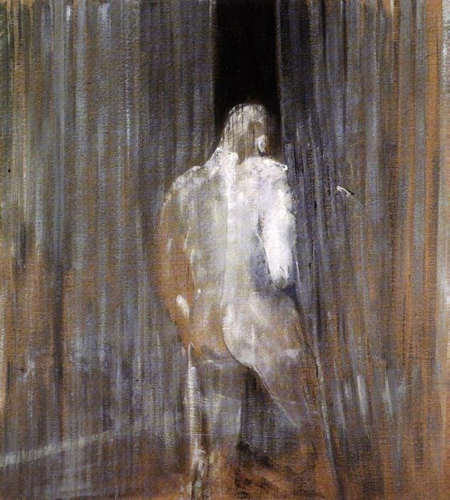
In response to Birgit I went back to the original post in an attempt to temper the blur. Birgit has come to accept, perhaps embrace, the blurriness, while I have gone in the other direction. I tried the sharpening and blurring tools with unsatisfactory results and turned to the old standbys, poster and watercolor, in the artistic filters.
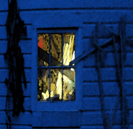
This is the image posterized. It’s alright but has lost the softness of the original.
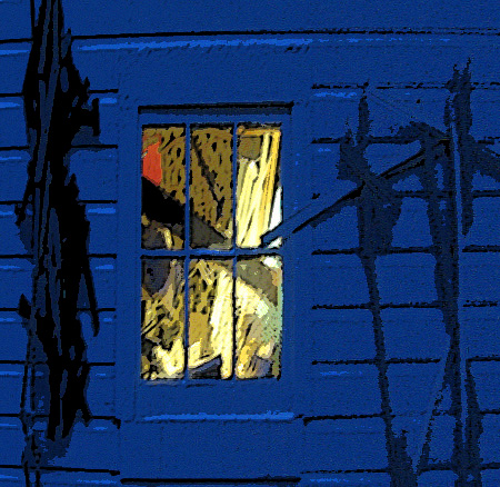
This is watercolored and has the usual silk screened look. The view through the window has gone flat.
This is it now; time to declare the first post the winner – or perhaps the least loser.
You Gloaming commentators have done a splendid job as com-mentors.
The right combination of detail, color and air seems to be at issue. In this version I have blurred the contents of the window, lightened the blues and have shown more of the right wall hanging. The left hanging cannot be retrieved without going back to the raw image. If, however, it is missed, then I’ll go back. That would be O.K. as one of my new year’s resolutions was to persevere.
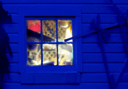
In response to Steve’s comment about the red spot and the common positive about the blueness and negative about the blurriness, I took up residence last evening by the window and wall and waited. A series of exposures was required as I had but a vague memory of the original lighting conditions. Fortunately, a few came close.

I took the opportunity to make the blue a bit more theatrical and to emphasize the red spot in the window (a bag full of straps). I also cleaned up a number of distractions.
Is it better?