In an interview for a quilting magazine recently, I was asked why I liked oil paints. I found myself speaking lovingly about the names of paints — burnt sienna, cadmium yellow, quinacridone magenta, perylene black, French ultramarine.
My response surprised (even) me. I hadn’t actually thought of the names of colors as a reason to like a specific medium. Thinking it over, however, I came to understand why I fell into praising the precisely designated oil paints. And watercolor paints. And even acrylics.
It isn’t the names, charming as I find them, so much as it is that the names signify a specific color that holds fairly true across media and brands.
To understand the hold that standardized pigments have for me, you have to know that I began my color education with textile dyes rather than pigment paints. Once you have struggled with making art with dyes, you find that using pigmented paints seems ridiculously easy.
Here are reasons why dyes are inherently difficult to control.
Dyes form chemical bonds with the fabric; they fill up dye “receptors.” (Pigments coat and sometimes stain fabrics but they don’t form chemical bonds.)
Dyes will change color depending upon the temperature (ambient as well as liquid), the amount of time they have to react, the particular color and strength of the dye (which can also be altered by age), and/or the way you hold your tongue when you apply them.
Different fiber reactive dye colors “strike” the fabrics at different rates (and also attach to different fibers, say cotton and silk, at different rates and with different hues). This strike rate means that some dyes, like magenta, will produce color faster than others; if the dye is a mixture of colors, the fastest striking dye will take up most of the dye receptors in the fabric and therefore not be able to be dyed over regardless of the strength or depth of color any dye laid over it is. And some dyes travel further along the fabric than others, so the reach or wick of one color could be much longer than the reach of another, even given the same consistency of liquidity.
With fiber reactive dyes, temperatures have to be maintained at a constant state and should be no lower than 75 degrees F and no higher than 95 degrees F. You can compensate for lower temperatures by increasing the time a dye is allowed to set, but different colors of dyes have different requirements, so what works for fuchsia doesn’t work for turquoise. And higher temperatures of water or air will kill the dyes before they have time to react (except for magenta….)
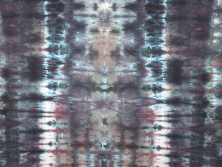
So here’s what can happen when the bully dye fuschia (magenta) attacks the fabric: This mixture looked like a purple when it was in solution.

Of course, a great deal of the joy of fiber reactive dyes comes precisely from precisely this inprecision. If you drop a bit of yellow into an already (blue) dyed cloth, the yellow will wick out in unexpected and beautiful ways. Most domestic dyers work toward this kind of indeterminate never replicable, often delightful, result. Then they cut the fabric making use of only such parts of it as work for their needs.
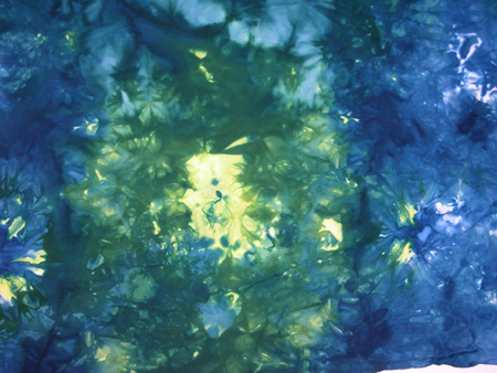
If you use wax as a resisting agent, as batik dyers do, you can achieve relatively precise markings with your paintings as well as tight control over line making and wicking. Stencils, stamps, and screen printing, good for replicating imagery, can also be used for very precise effects. And occasionally an artist will be able to control her materials and environment so precisely that she will be able to brushpaint representational scenes with dyes, using a thickening medium to control flow and wicking. However, the thickener lightens the color, so it’s difficult to get intense dye paintings.
The less good dyers, among whom I include myself, play with the dyes, allowing their indeterminate results to emerge senedipitously. I can’t control the temperature in my dye studio, which is almost always under the recommended 75 degrees F; I am cavalier about how long I allow my batched dye paints to sit and get fixed. I measure with teaspoons rather than weighing the dye stuffs. I throw salt on top my dyeing fabric. All this makes the results variable.
But without the ability to control the environment, with a certain amount of impatience, and without the kind of temperament that loves precision and planning ahead, I have found that I am ultimately dissatisfied with dyed effects. I now want my tools to work in expected ways, so the creativity comes out of my fingers and mind. I find myself loving pigment — for its precision of color, for its ability to make fine as well as crude marks, for its lack of variability in moving across the surface of the support, for its sheer immediacy.
Dyeing is a joy and has a lot of advantages for textile use, but for the immediate rush of pleasure in making art, I’ll take pigment.
The best reference for beginning and intermediate dyers can be found on Paula Burch’s website:
Paula lists the pure (unmixed) procion MX fiber reactive dyes along with the names various manufacturers give them: this list helps in achieving both the color desired and resisting unwanted strikes and wicking.
She also has a good discussion about the differences between paints and dyes
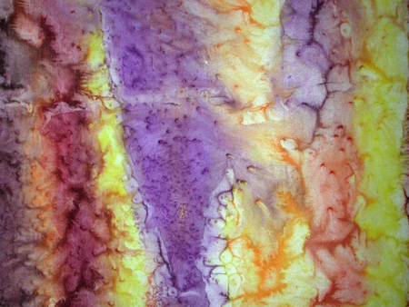
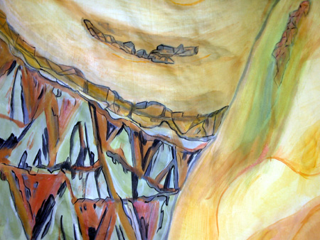
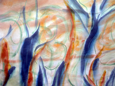
But just for comparison, here are some details of a cotton textile that I’ve painted rather than dyed. I don’t think I could achieve these results with dyes, even with fullest knowledge, patience, and methodical controls:

June,
My reaction is that the dyed fabrics have a quality of raw art materials (call them “textures”) that would be interesting to construct something else with, much as fields of paint are used in paintings. If the goal with the quilting is to stitch together different pieces of these dyed cloths, the random effects would seem to be fine — you could just select the pieces that fit your needs. Combining this with paint for precise control where necessary would round out the method.
If I were going to do this, I would make more subtle dye patterns so that when I painted on the quilt I could emphasize parts of the pattern but not be overwhelmed by the dye.
I like the first dye-pattern and the painted examples a lot, but I’d sort of like to see a combination.
Karl,
Your description is precisely how most hand-dyes, including my own, are used. I didn’t show any of my painted hand-dyes because they are usually overworked with textile (pigment) paints. Dyers distinguish between using dye as a paint and other dye methods and mostly they don’t use dye as paint in any conventional meaning of the word. I have done so, but always I need to rework with pigment.
And in fact, Miocene (the ram’s head piece I’ve talked about ad nauseum) is a combination of dyed fabric, cut up and combined with lots of other stuff, including pigmented paint.
June,
This is a good post and lot of visual subtleties. I need to think some more about the material though as it is a bit technical. I am enjoying the paintings for the moment.
June:
What are you going to do with all that equipment and all those supplies?
I must admit that the dyed fabrics in your post have a certain predictable quality, based, I would assume, on the mechanics of the medium. And then, the last two: brighter, sharper and speaking a more articulate language.
Strictly speaking, certain of your tubed colors are themselves dyes: thalo green, vermilion, to name two. I, myself, like to use these when doing varnishes, as a deep transparency is possible.
Sunil,
I can see your love of the paint in your work. The technicalities of the dye are what prevent the artist from that kind of deep-seated immediate gratification.
I guess what I should be asking is whether there are media that immediately grab you or that you use in spite of the delayed gratification.
Jay,
I didn’t know that about pthalo green and vermillion. In fact, I’m going to have to go back and check out Paula’s dye basics and see what she says. The paint pigments of course can be transparent or opaque, whereas the dyes are all transparent.
And most ink jet printers are dye based, which is why they run when you drop water on them. They can be set using treated fabric or, I suppose, treated paper.
But Jay, how do you know that the Pthalo is dye? I suspect the varnish solution fixes the color, just as I could fix the dyes by overpainting with an acrylic medium (although I don’t think I’ve ever done that).
Does anyone else like playing with the technicalities of various media, just to see which ones suit a particular style?
June:
Ahh zee eenternet – eez zee cat’s veeskers no? Checked in and found that “thalo”, as a term, is a truncated form of phthalocyanine. The stuff seems to be both dyish and pigmentish at once: coming from a family of dyes, but being insoluble and used in particle form. It becomes transparent in varnish and can impart a lovely deep effect.
So there’s another great name to add to your list. Also checked the quinacridone while I was at it. Paint suppliers don’t want to identify it as a dye – perhaps it cheapens the image somehow – but the literature refers to a family of quinacridone dyes, with quinacridone violet mentioned, but in another context.
the colors are so gorgeous, I just get lost in them!
Jay, I’m intrigued.
In my brief research, I have found that the quinacridones and Pthalos are perhaps petroleum “downstream products” not the fiber reactive dye stuffs with which most domestic dyers work. I think the insolubility in water factor is what differentiates fiber reactive dyes and those pigments that are intermediate between dyes and pigments. My knowledge is not of commercial dye stuffs, which is a whole ‘nother world indeed, requiring a chemist’s interest.
As you said, there is family of quinacridone paints, which are absolutely delightful — the red family, but running the gamut from golden yellow through violet. Very transparent, very brilliant.
Here’s the best comparison between dyes and pigments that I could find on the web.
http://www.dyespigments.com/difference-pigments-dyes.html
June:
There are two kinds of “downstream” petroleum products: one leaves a colorful slick and a messy residue on the oar while the others are chemical derivatives of crude oil.
I think that, if we go looking, we’ll find a lot of pretty dyes with pretty names.
Not mentioned so far is the great difference in permanence: pigments will retain their color much longer than dyes, especially if exposed to light. The great advance in printer technology recently has been the ability to use pigments rather than dye-based inks. Of course, the hard part of making something that will last is making something worth keeping around.
Good points, Steve.
However, there are UV filter sprays and chemical fixatives that make dyes womewhat more lightfast — at least as permanent as watercolor, which isn’t saying a lot, come to think of it.
But the hard part — well, that’s the hard part.
June,
Greetings from Germany.
Thank you for your methods!!!
June,
As I continue my explorations around the color wheel, I appreciate your evocation of some of these colors much more intensely. In fact only recently have some of these colors started to give up their secrets to me…