Despite all the discussion and analysis on A&P, I seldom, if ever, carry it consciously in my head when I’m out photographing. If it happens to be there at the start, it soon flees as I focus on the subject. Sub-consciously, who’s to say? In any case, in my first outing after writing about complexity, I made some pictures that not only relate to that issue, but seem to have a loose resemblance to some of the drawings discussed. They also involve the edges June brought up recently, so I’ll have a look at that, as well.
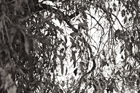
The idea was to do some catching up on a couple of languishing projects by heading for a horse pasture that also has trees I’ve photographed for Cottonwoods. The horses were way too attentive (a blurred nose at three inches does not an exciting photo make), so I headed for the trees along the trace of creek. I wasn’t hugely inspired, but I did enjoy the backlighting from the setting sun, and captured images from a dozen or so spots.
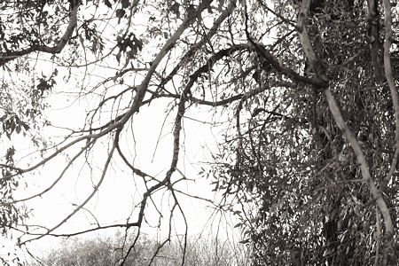
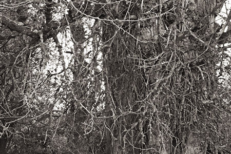
I think these images share some qualities of nearly allover busy-ness with the drawings from the Complexity series of Nelleke Beltjens. There is some negative space, but not much, and it’s almost as if it’s there primarily to emphasize the complex rest of it. The branches extending out into the sky are like her exploring lines.
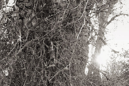
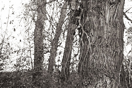
The opaque branches and twigs, and nearly opaque leaves, were set against a bright sky. The consequent wrapping of light around them is most evident in the next to last image above, where the sun takes quite a bite out of one of the trunks. Exactly as Carlson said, and June quoted, I have to resist a tendency to make the tree parts too dark, or one loses the sense of luminosity from the sky. I try to show this below in a full resolution detail from near the lower right corner of the first picture.
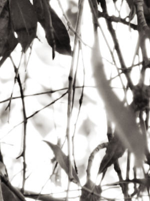
original
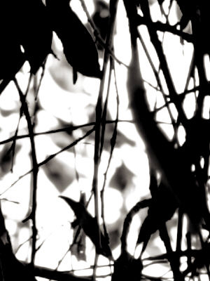
darkened
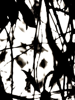
darkened and sharpened
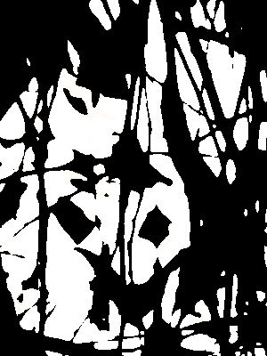
two tones (maximum contrast)
The sky is maximum white in all cases, but its radiance decreases, and it becomes nearly dead in the fully posterized version.
On this web page, with its limitations, I prefer the detail to the whole image. With an actual print, especially a large one, I can go close and examine all the lovely details, while also keeping a grasp of the whole. It’s the combination that makes complexity interesting (if it is), while also making a larger statement about the world.

I love image 3 with all its complexity. Looking at it, I expect hobbits to appear.
Organically grown shapes touch me more strongly than what you earlier showed in the ‘Complexity series’
Steve:
Posterizing is a good way to check on the qualities of one’s composition. The fourth image is not quite as heady as the first for its lack of atmosphere and gradation, but it, like an x-ray, tells where the bones are.
A principle that I observe in the breach is that a satisfying statement should have an underlying, or overarching simplicity, depending on how one envisions such things. Ye olde twenty five words or less.
Steve do you exhibit this at all? How would your work look framed and what size are the photos?
You can perhaps post a photo of your hanged pieces if you have any particular ones from this post.
Your lighting is just fine , my favourite is the 5th photo of the trunk. I notice your have a fascination with the textures in nature, specially close ups.
Angela,
I have exhibited several projects, but not this one so far. The gallery I was in is now closed and I actually sell more (not many) prints via the Internet than directly. Only once have I shipped a print framed. I’ve used varied frames for the pictures I’ve sold directly: handmade paper-covered wood, modern silver metal, and classic black. Sizes vary from 9×9 to 16×20 (dimensions in inches). I haven’t printed any of the images in this post, but from experience with the similar Sourdough Trail pictures, I think I would choose an unobtrusive metal frame–it distracts less from the subject.
However, this year at least, I’ve almost completely renounced showing, and am putting as much of my scarce time and energy into just working as I can.
You’re right, texture matters a lot to me, but not only texture. It has to be more complicated, which gets into composition. Those collections of photographs of “textures in nature” and the like don’t interest me at all. I’ll see if I can work out a title with the word that fits a larger range of projects…
Steve,
I stop by here every once and awhile to see what you are up to and quite often we are working on like projects. I have a Circles of Confusion project that I am working on, exploring areas of focus and dis-focus. I’d be curious to have your thoughts.
On your images, I agree that the detail crop is more interesting as an image, and I bet would look great nice and big. Mike
Mike,
Those are delightful pictures you have on both blog and web site. There is indeed a strong similarity of your interests and mine in my Sourdough Trail photographs, but yours have quite a different feel, being in color. I especially liked your crab tree, which reminded me of Japan, and perhaps because it didn’t have the dominating blue sky. Perhaps that bright sky makes the picture more about light than color, which seems to be what I prefer. The web site pictures especially seem also concerned with the complexity level that one is always dealing with in such images. Deftly handled! Thanks for stopping by and for sharing what you’re up to.