The dreamings of the Australian aboriginines represent a kind of art that goes to the core of their identities. To the extent that that represents any kind of an accurate description, allow me to state that these images are at something of an opposite extreme in that they play around loosely with important documents.
My initial impulse in doing maps was to effect some sort of transformation. A road map tells you what you, in your car, need to know about getting around. How about if the map were treated as a template through which other concerns were granted expression? There’s a lot to think about and do in this department and I feel that I have gotten so far as to dip my little toe so far.

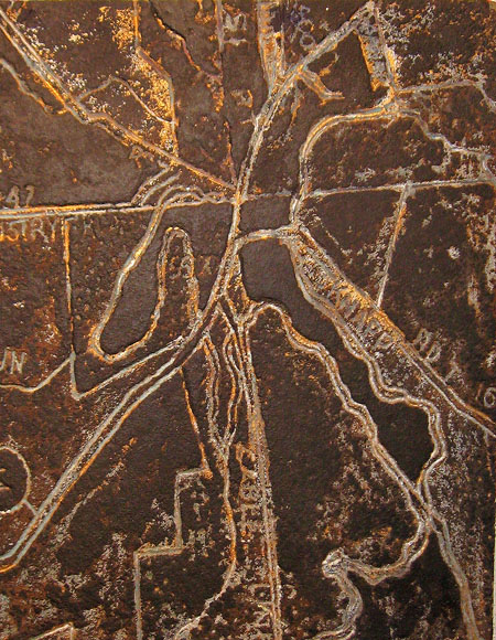
This object is a straight-out gouge into a piece of particle board. It is derived from a map of Peninsula, Ohio, a picturesque village with bars, gift shops, but no place to buy a toothbrush. I was looking to produce the effect of a rather rusticated brass plaque.

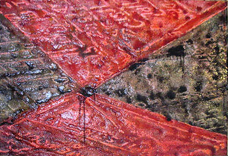
The styrofoam stuff now scares me to death. But there was a time not long ago when I went after it full bore. This isn’t the pink polystyrene that I have mentioned, but a white granular material with the strength of compressed popcorn. On went the downtown layout of a small town over by Sandusky, followed by the familiar sequence of blocking out areas to remain protruded, hitting with hot air from a paint remover gun to shrink the unprotected and covering over with paint and glazes. Styrofoam dissolves in oil-based mediums so the piece required a substantial application of water based primer before getting its polyurethane.

I don’t know, there’s just something about the Cotswolds in England that gets me. I picture a gentle kind of place, an impression unsullied by any personal experience. There’s also something about a Cotswold map, a flowing quality where both water and people follow the lay of the land, that sounds a call to action. I created a relief which I then painted in an alla prima fashion – color, glaze all laid down within an hour. It fell into this pattern.

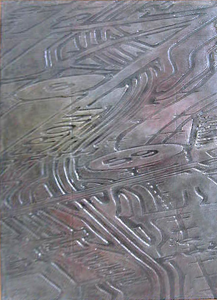
I’m convinced that Akron, Ohio sits over and is one with some kind of earth-based and upwelling source of spirituality. Especially over by the northwestern side of town I get an emotionally mentholated feeling. Enough is it to make the hair of my brain stand on end. That, plus the fact that Akron presents another flow-based scape, makes it one of my preferred subjects.
Here I used the plastic cover sheet that comes with a Foamula board as a kind of frisket to blank out certain areas from the fiery gun. A few colors – mostly black – and a rub of silver and into the racks it went.
Didn’t I post on this subject before?

Jay,
I read up on some of the places that you portrait so differently.
Rusticated brass plaque for Peninsula.
Why black/red for Sandusky (I smell the fumes from hitting Styrofoam with at paint remover gun)? Major stop on the ‘Underground Railroad’, now indoor and outdoor water parks.
Cotwolds as yellow oolitic limestone; steep escarpments on two sides and a gentle slop south; inspired some of England’s finest composers. This reminds of David’s natural-shapes inspired paintings that sing. But where is the water in the singing Cotwolds landscape? Maybe, just like in Australia, the thirsty landscape swallows up the water.
And finally Akron in a space-age silver. I remember you talking about the energy in Akron before. Perhaps, there is a ‘dreaming for you that goes to the core of your identity’? Do other people feel that energy too?
Birgit:
You actually did that?
Just to let you know, I often do things because they seem like a good idea. Only later will I gain some understanding of the impulse. I’ve been wondering why I did the scrambled compass( and, yes, thank you, I have adopted the title SEWN Up) aside from its value as an exercise. In writing this post it occurred to me that the compass and the map share a common orienteering nature and that I appear to want to re- or disorganize them. That realization, that little point of light has been useful in illuminating a few dark spots in my past.
Peninsula is deeply connected with the Ohio Canal and features a lot of explanatory placards. So the rusticated plaque kind of fits in – if one wants it to.
I had read that about the Cotswolds – that it is oolitic. Moreover, the area features stony little cottages. Who knows, perhaps I was moved to create something goo-litic. One thing for sure, I seem to like to take a big step away from the understood nature of the area in question. In all fairness I should drop the place names and say something like “Landscape”, or drop such references altogether.
I actually used the gun outside, but did notice squirrels dropping from the tree. Near, but not in Sandusky: I’ll leave the town anonymous as I will adopt a no-tell policy. The red and black are rude and without redeeming virtue. However, in some parallel universe this town had had a dual racial makeup, divided into neighborhoods, or those are the school colors, or a mapmaker had chosen to so delineate some municipal distinction. Since this business with the maps is so arbitrary, meanings can be assigned post facto.
James Joyce had a “picture” of the city of Cork composed entirely of cork. So I guess an image of Akron should be in rubber. But don’t forget that the musical group Devo hails from Akron, Marylin Manson from just down the road, Dr. Bob of AAA fame, Chrissy Hynde, Brenda Sykes, Lebron James. So a little silver might be right. If you mix platinum with rubber you get an artist material called akron.
I thought for sure that there would be some buzz on the net about spiritual Akron. Nothing. Maybe my fillings are reacting to a power line.
Jay,
You did post something on this about a year ago: it’s the first result if you search for “maps” using the search box in the sidebar, which is working better than it once did. But revisiting is always good. In fact, it looks like maps constitute a bit of a theme which would be nice to bring out by linkng some of these posts via tags. Mind if I add a “maps” tag to your post?
Apparently our sidebar tags widget disappeared at some point (during upgrade?) and I haven’t even noticed, having been so long out of it. But I’ve turned it on again, as it seems the best way to get a sense of topics being discussed. Our titles are fun, but not always descriptive, and too long to show many of them. It’s clear a little updating is called for, so tag away!
Steve:
Yep. Map. And to think that I posted last year and lost track of it. Turns out that I had somewhat different things to say about the same image.
Jay,
If you had not named your map Cotswolds, I probably never would have learned about that region.
I read of a community somewhere south (Texas?) where people sensitive to electromagnetic radiation chose to live without it. About that time (1996) the National Academy of Sciences released a report claiming that there was no danger from EMF. But now and then studies are still being done on its effect on children.
I do believe that people have different sensitivities to EMF. Without knowing what it was, Troels instinctively would not set his foot into our mass-spec facility. He likened it to a foul-smelling men’s room.
From the above, I suggest that your Akron high is not produced by power lines.
Birgit:
Marfa maybe? They have something there called the Marfa lights. People are sure that they see something at night – chamber of commerce loves it. Maybe Troels has a good nose. Maybe a mass in there isn’t up to spec.
I’m a big believer in places having a spiritual energy and Ohio seems to have plenty–Hueston Woods is one for me, and definitely the Serpent Mound.
You have such intriguing methods, Jay. Your response to the Cotswold reminds me of Hockney’s Yorkshire paintings, but maybe only in the sense of feeling linked to a place? Not sure right now how that works but it’s what I’m thinking of. When I first look at the Akron map work, I think of crop circles.
Tree:
Hueston Woods? I can remember a drunken party at the lodge – spirits were certainly involved. It would be good to return there in my present frame of reference. Serpent Mound is profoundly mysterious.
I haf my vays. Hockney: I’ll have to look up those paintings. Concerning Akron and crop circles, I bet it has to do with those route markers.
The Hockneys are gorgeous paintings although you may wonder why the heck I thought of them in the context of your work. I suppose if anything, they are more like June’s landscapes.
Not just the route markers, all of it.
Jay,
I love anything to do with maps, real maps and metaphorical ones also. Not to mention places represented in maps. Which is why I don’t have anything GPS: I’d rather read, look, and discover than just get there.
I especially like the texture and coloring of the first map; I’m not feeling much spirituality come through the Akron piece. But I don’t doubt the possibility, being a believer like Tree in local spirit. I’m also a fan of effigy mounds, of which we have quite a few in Madison, Wisconsin, where I grew up. In fact, they figure in a novel I’m theoretically co-writing with my wife and brother.
By the way, I spent a chunk of yesterday programming the tags to work so that they are really Recent Tags (in reverse time order), not just the most common ones. The font size represents the number of posts carrying a given tag.
Steve, the mounds in Madison are related to the Cahokian people, correct? I just finished reading a book on Cahokia and it mentioned mound builders in Wisconsin that were part of that civilization which was based in and around what is now St. Louis (in case you didn’t know, it was new information for me).
The tags look great. Thanks for all the work you do.
Steve:
In dealing with spirituality it is often difficult to depict the level and type of emotion contained therein. Extraction of atmospherics through formal means is part of what I’m after in the map program. When I applied the silvery finish something in me said; “For me it is Akron.” Maybe it corresponds to the name itself which could apply to a metallic element. The Akron Plate Railroad – that kind of thing.
Co-authorship is relatively common. But I’m unaware of a novel written by three people.
Tree,
That’s a great book about Cahokia; I haven’t read it, but gave it to my brother for Christmas, so hopefully it will get shared around. I’m sure the Wisconsin mound builders were connected, but I don’t know much beyond that yet.
Jay,
Akron does have a metallic sound to it. The other association the piece raises for me, besides the train tracks you refer to, is to oil refineries, with all their pipes and tanks. I always get an eerie feeling going through Laurel and Billings (MT) at night.
Tree:
Hockney has done some good work there. That may sound like faint praise, but he will impress me sometimes and at others I will think him vastly overrated. In this case I will consider it flattering to be in any way associated with this work.
I agree, Jay, he can be overrated, and I think some critics go overboard when praising even the Yorkshire series.
I saw the Yorkshire paintings at the Boston MFA years ago, before I really knew who he is, and I was impressed with their colors, at the very least, and I keep coming back to them over the years–keep postcards of them up in my living room. I think because he honors the place, if that makes sense.
Tree:
I don’t like to persist in negative opinions and have been pleased to experience such a Hockney revision.
The ghost of Monet may be sensed peering knowingly at these Yorkshire paintings. For certain, Hockney aligns himself with a large and growing cadre of environmental artists – those who work for Pixar (if still in existence) and other animation houses. These people create stunning settings. Studio Ghibli makes movies in which the visual depictions are at least half the story.
I also enjoyed Hockney’s Yorkshire works, see some musings in a prior post. I especially value him for original approaches–as with his photograph composities exploring perspective–even if I’m not always overly taken with the results.
I love the detailed cityscapes in some Ghibli films. Very true to Japan while being delightfully decorative. Always brings on nostalgia.
I’m not familiar with Ghibi films but I did see an animated feature recently that really impressed me. It’s called Persepolis and it’s based on a graphic novel that’s an autobiography of a young woman growing up in Iran and Europe during the revolution.
Jay, my favorite image is the top one. In monochrome, and without symbols, it has the same sort of beauty you experience looking out of an airplane window.
Aerial views and maps are remind me of Aboriginal paintings, in that they are records of journeys, of human interaction with nature.
David:
That’s a lot of beauty, depending upon the flight that you book. I happen to like the one from LAX to Houston, which takes one over the high desert. Then there’s the flight into SEATAC that allows a great view up and down the Cascade volcanoes.
Jay,
Some shapes in the Peninsula closely resemble the shapes in David’s Babel. Peninsula is more 2-D than Babel where the tower and other shapes compete thereby making Babel more 3-D.
The oolithic sandstone in Cotswold has a 3-D look like Turner’s Shore scene with waves.
What I am musing about: Maps, 2-D; abstract art, often 2D; sketching my hand last night and plein air painting, 3D; David’s Babel, 2D + 3D.