Posted by Jay on May 22nd, 2008
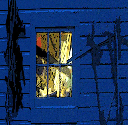
In response to Birgit I went back to the original post in an attempt to temper the blur. Birgit has come to accept, perhaps embrace, the blurriness, while I have gone in the other direction. I tried the sharpening and blurring tools with unsatisfactory results and turned to the old standbys, poster and watercolor, in the artistic filters.

This is the image posterized. It’s alright but has lost the softness of the original.

This is watercolored and has the usual silk screened look. The view through the window has gone flat.
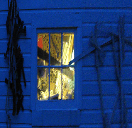
This is it now; time to declare the first post the winner – or perhaps the least loser.
Posted by Jay on May 22nd, 2008
You Gloaming commentators have done a splendid job as com-mentors.
The right combination of detail, color and air seems to be at issue. In this version I have blurred the contents of the window, lightened the blues and have shown more of the right wall hanging. The left hanging cannot be retrieved without going back to the raw image. If, however, it is missed, then I’ll go back. That would be O.K. as one of my new year’s resolutions was to persevere.
?
Posted by Jay on May 21st, 2008
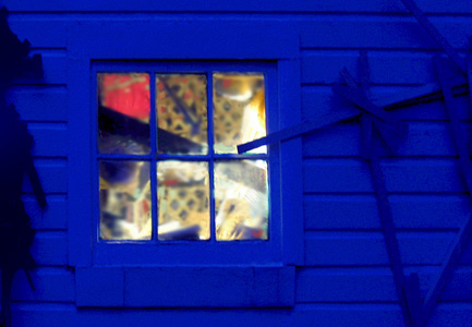
In response to Steve’s comment about the red spot and the common positive about the blueness and negative about the blurriness, I took up residence last evening by the window and wall and waited. A series of exposures was required as I had but a vague memory of the original lighting conditions. Fortunately, a few came close.

I took the opportunity to make the blue a bit more theatrical and to emphasize the red spot in the window (a bag full of straps). I also cleaned up a number of distractions.
Is it better?
Posted by Jay on May 14th, 2008
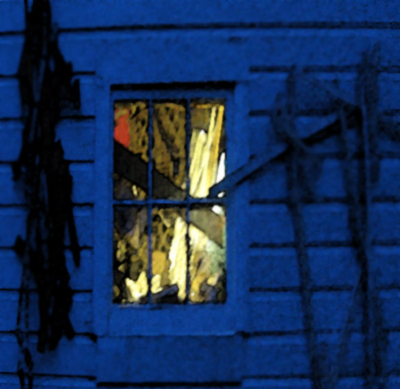
A light was burning in my workshop this last evening and there was something so Cotswoldish about the whole affair that I grabbed my camera in a race with the dwindling light.

I set the dial on aperture priority to avoid a flash exposure and the result was a little smeared. I can’t make up my mind about it. On the one hand it creates a sense of remove, but on the other, it appears simply blurry. Maybe a foggy quality would be better. What do you think?
Posted by Jay on May 1st, 2008
This is an exercise in filling the Art and Perception news hole, deja vu or a naked bid for attention, take your pick.
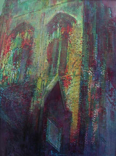
A technique in these architectural paintings – and something which has appeared in previous posts – is the use of underlying intaglios or raised portions. Such a pattern can act to hold a design that comes through whatever terrain of filler and paint is later applied.
I swim at Notre Dame College, a school whose modest campus is dominated by an imposing main building. This began as a shot, in white board mode, of a corner of that structure. This was then traced out on plywood with whatever appeared as black becoming a raised area. This was then followed by a period of back and forth with opaque colors and glazes. The structure ended up as both firm and dissolving.
more… »
Posted by Jay on April 14th, 2008
Birgit’s post brings up some troublesome memories.
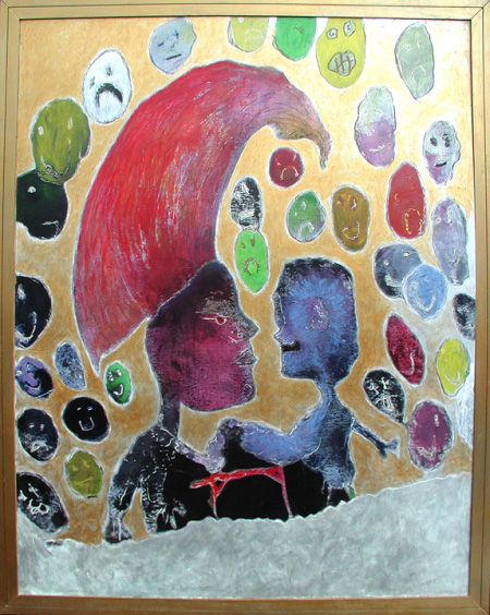
My three boys, in their earlier years, drew a lot. Much of it consisted of takes on what they saw in the media with some creative things here and there. In the late nineties I began to eye these drawings, curious about their potential as subject matter: what if I projected them on boards and applied paint..?..
I felt a need to ask permission of the boys. Theirs was a “whatever” attitude, most of the drawings beyond memory or caring. I tried to find examples that didn’t include Stars Wars episodes or Batman, and which had the aspect of a personal narrative. There were, among the hampers full of these things, a limited number that were fairly well composed.
How to paint the images? Most had few spatial cues, with elements positioned where space allowed. The boys were not colorists by nature, so I had little to go on in that regard. Should the cast of characters occupy some sort of floating world, or should they be grounded in some fashion? I labored through a dozen or more attempts in a quest to find common ground between the originals and my own ideas.
One of the few that emerged as a somewhat satisfactory composite was this depiction, by Bret, of two characters engaged in a public arm-wrestling match. I scored a masonite surface with a Dremel and rubbed in the color. The negative spaces were given a gold finish. The painting is about four feet long.
more… »
Posted by Jay on April 5th, 2008
Yes, in fact.
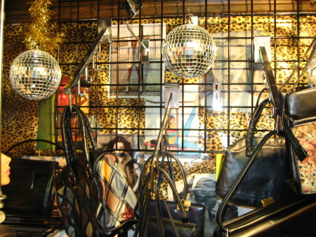
A two month toil refinishing the bathroom is coming to a close and its time for that finishing touch. This led us to a round of boutiques. One was Flower Child, an emporium known for its selection of leg lamps. It is a warren of clutter and I had to pull out the camera.

This first is a straight shot. Eye fatigue is a common condition at Flower Child.
more… »
