Posted by June Underwood on March 21st, 2009
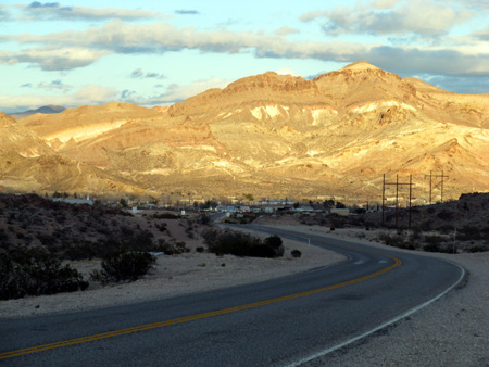
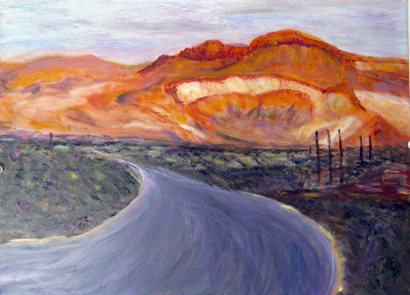
And now, at this point (day 30) in this particular residency in Beatty, Nevada, I am pondering a conundrum about my own landscape work. I haven’t quite enough distance to say for certain [pun recognized after it was made] but it seems to me that my interest in context and a sense of place interferes with my achieving a stylistic breakthrough, particularly with the set pieces that I love, like the mountains around Beatty.

As my colleague and friend David T would say: if he walked into a gallery with my landscape paintings, he wouldn’t think of them as being “by June Underwood,”just as “nice” (not a compliment) landscape paintings.

more… »
Posted by June Underwood on March 6th, 2009
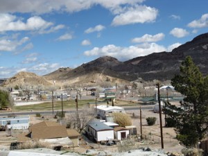
One of my preoccupations in painting inhabited space is to see how people perceive and decorate their surrounds. In cities, it seems to me, conformity sometimes rules — or perhaps there’s too much unconformity to make sense of a singular type of decorative decorum. Whatever the case, I find that peering at small towns and villages gives me a certain kind of data; both individually and collectively, people seem to want to dress up, decorate, make order of what lies around them. And in places with few people, it’s possible to suss out what that decorative impulse consists of.
A particular caution that I remind myself of — looking at what people do to dress up their trailer houses requires a disciplined mind. My goal is to neither romanticize nor to satirize. I allow myself no irony about individual choices, although lots of irony can abound when examining communal structures (like bridges and mine tailings). What I want is to see what’s there without indulging in judgment.
So what is the predominate beautification element of Beatty Nevada ( 220 miles south of Reno, 110 miles north of Las Vegas, population 1200, where the Amargosa River surfaces, just for a minute, before being swallowed by the Amargosa desert [a subset of the Mojave desert])?

more… »
Posted by June Underwood on January 23rd, 2009
I have just joined Facebook (thanks, D.) and of course, instantly found a group dedicated to a textile artist’s focus: namely, texture.
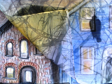
The photos of “texture” on the group site were close-ups, both of quilted fabric and of objects that showed as textured. I started through my photos and quickly realized that deciding on what shows texture is not as easy as might be imagined. Here are some possibilities from my files.

The High Note, JOU, Computer images on Silk, quilted, 12 x 12″, 2008.
The upper layer (of computer-printed sheer fabric) is turned back to show under layer. Normally the sheer would fall over the entire piece, showing through as it does on the right bottom. This dropping of the sheer obscures much of the texture while at the same time, contradictorily, adds to it.

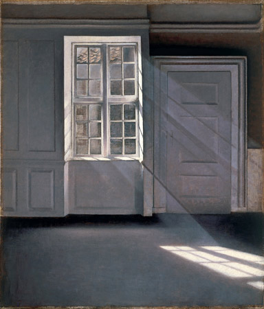
Vilhelm Hammershoi, Sunbeam (and various other titles), 1900, oil on canvas.
more… »
Posted by June Underwood on January 12th, 2009

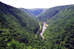
Pine Creek Gorge, photo from Wikipedia Commons, Commons licensing
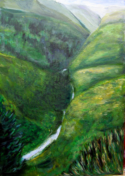
I have been violating one of my basic principles. I have, gasp, been painting from photographs.

Pine Creek Gorge 2, 12 x 16″ Oil on board, 2008
more… »
Posted by Steve Durbin on January 4th, 2009
I’ve been photographing horses for well over a year now, and I’m feeling it’s time to put together a show, or at least a portfolio. I would be happy just continuing to make photographs indefinitely, but I’d be happier grappling with the work in another way as well, reviewing it and thinking about it and looking for themes or ideas. A few thoughts have been mentioned in previous posts, but none has risen to the level of forming the backbone of a potential statement. Perhaps the most striking thing to emerge from my photographs is a lack of interest in anything resembling a classic, noble, iconic western horse. In fact, I notice that none of the images selected for this post even depicts an entire animal (though I have some that do).
One thing I realized in the course of the recent Morandi discussions is that the edges of the bodies are often blurred, or more generally obscured, either through intervening snow or grass…
more… »
Posted by June Underwood on December 26th, 2008
In a site called “Hold this Thought” Tom Livingston (Between Silence and Light) quotes architect Louis Kahn:
Architect Louis Kahn’s writings about daylight resonate with me. Here he talks about the nature of a room and its natural light:
“The room is not only the beginning of architecture: it is an extension of self. If you think about it, you realize that you don’t say the same thing in a small room that you say in a large room. If I were to speak in a great hall, I would have to pick one person who smiles at me in order to be able to speak at all.
…
Also marvelous in a room is the light that comes through the windows of that room and that belongs to the room. The sun does not realize how wonderful it is until after a room is made. A man’s creation, the making of a room, is nothing short of a miracle. Just think, that a man can claim a slice of the sun.”
http://www.holdthisthought.org/blog/index.cfm/2008/12/23/Between-Silence-and-Light-Tom-Livingston
I’m rather addicted to painting plein air, but the weather in western Oregon is more like eastern Kansas (ie snow, ice, slush, ugh!) right now. So I’ve been painting from my windows, which frame various neighborhood views and foliage. But the Kahn quote also gets me to thinking about the nature of rooms, which I haven’t painted.

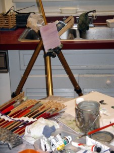
This is the unprepossessing set-up in my kitchen. The reason for painting in the kitchen, in spite of the traffic and the high window, is that the best tree in the vicinity faces the sink. It is a continual source of happiness to me — to be cleansing the cutlery while gazing at the ancient face of the huge cherry, with all its anciliary objects — squirrels, hanging plants, pots on the fence that leans against it.
more… »
Posted by June Underwood on December 12th, 2008
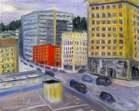
On Monday, I painted two plein aire oils from the uppermost level of a parking garage. On Tuesday I attended a crit session with some other painters that I meet with regularly. OF course, I showed them the paintings.
I managed to remember to photograph the first painting twice — once as it emerged from the garage session, and then again after I had been through the critique and had tweaked it in the studio. I didn’t do a lot to this painting in my second go-round, but when I finished I was concerned about the loss of some of the “naive” quality of the red building. Here are images of the two versions:

Library Parking Garage, View South (first draft) 12 x 16, oil on board more… »
