Posted by Jay on June 21st, 2009
This touches lightly upon some of our prior discussions.
I wanted to compare an Albers “Homage To The Square” iteration to a similar, but mechanical version as rendered in Adobe Illustrator.
The Albers image was chosen because it appears that he was trying for a gradation in a single hue. I lifted from a site where it is being offered as a poster. Therefore, it may be chromatically inaccurate – but what hey.
I created a replica of the outer limits and the innermost rectilinear shape in their respective relationships. I then sampled the poster for the colors of the outermost and innermost elements and then blended the elements, calling for one interim shape.
Obviously the interim shape is at issue. The Illustrator version splits the difference in size between inner and outer, as it does the color. Not so with Albers who made the interim more imposing in size and saturation, and to my eye it looks a whole lot better.

Filed in Uncategorized
- Comments closed
Posted by Steve Durbin on June 17th, 2009
How do we actually look at pictures, and how does that affect what we see in them? I started thinking about this again when I read about the Kuuk Thaayorre, an Aboriginal society in northern Australia. Lera Boroditsky (mentioned previously on A&P) reports on The Edge that their language and culture describe space and spatial relationships not in body-relative terms, but in absolute, land-fixed terms (I wonder if this is true for many Aboriginal langiages). When given a sequence of picture cards (showing a banana being eaten, or other obvious process) to arrange in time order,
Instead of arranging time from left to right, they arranged it from east to west. That is, when they were seated facing south, the cards went left to right. When they faced north, the cards went from right to left. When they faced east, the cards came toward the body and so on. This was true even though we never told any of our subjects which direction they faced. The Kuuk Thaayorre not only knew that already (usually much better than I did), but they also spontaneously used this spatial orientation to construct their representations of time.
more… »
Filed in across the arts,perception
- Tags: eye tracking, language, perception
- Comments closed
Posted by Angela Ferreira on June 16th, 2009
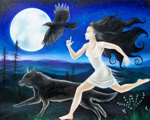
Running Free by Angela Ferreira
Title: Running Free
Size: 102×127 cm
Medium: Oil on canvas
Filed in being an artist,from imagination,interpretations,painting,working
- Comments closed
Posted by Birgit Zipser on June 10th, 2009
My latest opus, a duck rushing along the river during mating season:
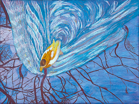
12 x 16, oil on board more… »
Filed in painting
- Tags: waves
- Comments closed
Posted by Steve Durbin on June 8th, 2009
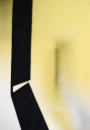
Jerry Rankin is a Montana artist who seems able to come up with completely new ideas in every project he undertakes. Only a few of these from his career are available on his web site. Recently he created two sculptures, variants of a theme, that have no precedent in anything he’s done before. Of thin, flat, black steel, they are very simple in design, being straight-edged boomerang-like shapes with one or two slots, respectively, cut into them. Yet they are intriguingly rich in perceptual surprises. I had the opportunity to borrow the cardboard maquettes, thinking I might try to illustrate these effects. Instead, I discovered an unforeseen aspect of how these objects relate to their surroundings.
more… »
Filed in photography,sculpture
- Tags: photography, sculpture
- Comments closed
Posted by Jay on June 4th, 2009
Bruce Marsh Commented on Josef Albers in reference a recent post on Giorgio Morandi. He presented the challenge of finding three colors that would create the sense of two colors overlapping – if I understand correctly. It made me wonder if this daunting task could be automatically solved by the computer.
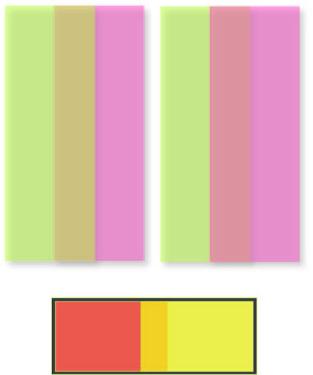
I heid to my Adobe Illustrator and drew two identical rectangles. One I colored green and the other a lavendar. I rendered both 50% transparent and slid one rectangle partially over the other. This created an intermediate hue; the rectangles acting like translucent panes. I then rearranged the panes by sending one back, and where the intermediate hue had been a green over lavendar, the new effect was lavendar over green. Overdoing it, I then introduced a offset shadow effect, which created the appearance of actual translucent objects. Not done, I tried red and yellow at a greater opacity.
Would Albers – having been kept ignorant of the means employed – approved?
Filed in Uncategorized
- Comments closed
Posted by Steve Durbin on June 1st, 2009
 1
1
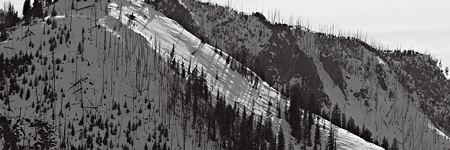
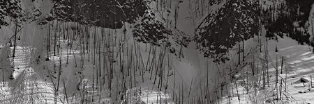
My day in Yellowstone last month was a long and varied one (see previous posts one, two, three). As I was leaving the park along the Madison river (almost the longest in the U.S.), I stopped occasionally to photograph the line of mountains on the opposite side of the valley.
 2
2
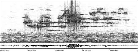
As I was doing this, I had in mind the images from the month before of the landscape by Tepee Creek (post here). I was hoping to catch some of the rhythm, perhaps even musicality, that I found in both places. I’ve nurtured such a poetic and mostly unrealized hope since I read about photographer Michael Smith’s epiphany with sonograms, like the one below of a hermit thrush. Smith was inspired by the beauty of such sonograms in creating some of his wide landscapes. (Though it’s worth pointing out that Smith’s wife, Paula Chamlee, in her own way, succeeded as well or better.)

more… »
Filed in landscape,photography
- Tags: mountains, musical, photography, winter, Yellowstone
- Comments closed


 1
1 2
2