[ Content | Sidebar ]

Facets

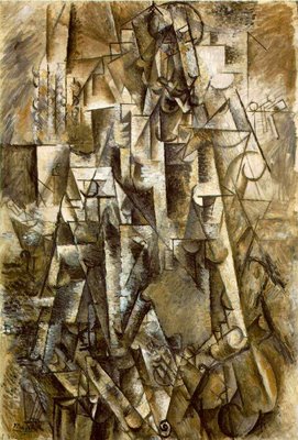
This has to have come up among the copious writings surrounding Cubism, but the facet – a unit of composition often used by Picasso and Braque – can resemble a sheet of paper hung on a wall.

Signature elements include a generally rectilinear shape, a highlight and a shadow side. One can imagine a wall full of notes and sketches begging to be arranged. Makes me think of Da Vinci and his cracks.

Some of you may be shaking your heads at my ignorance of the literature. If so, please bring me up to speed.

Cubism creation myths

My hazy recollection is that I  first heard cubism explained as a style that showed multiple points of view in a single painting. That may be fairly typical of the popular conception of what cubism is. But since one often has difficulty even telling what the subject is, it’s pretty clear that maximizing information conveyed was not the main motivation for Picasso, Braque, and company. I’ve long felt that I didn’t really have much grasp of what cubism really was, of what the artists cared about and thought about. Following are some snippets I’ve encountered, in no particular order.

more… »

Spring

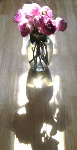
This time of the year is special. Last spring I was taken by dappled light as it fell upon the house and the old fence. But that didn’t last as trees were felled and the fence was replaced by something smooth, implacable and untouched by time. But the setting sun remains to cast a languid glow over the kitchen table.

What is your favorite time of the year?

Dark blue snow

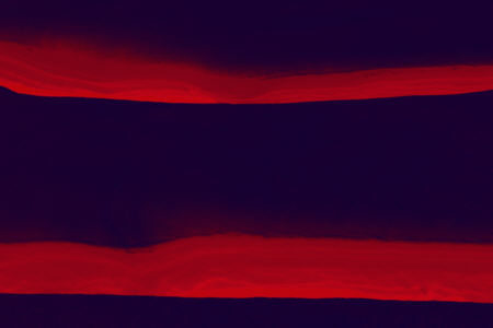
I just visited the Walker Art Center in Minneapolis, where I saw, among other things, a couple of Rothko paintings and a Barnett Newman. Maybe that’s why this installment of the continuing Yellowstone day is more colorful than previous ones (see parts one and two).

more… »

yellow canoe – critique

I had painted the yellow canoe a few weeks ago when the tasks ahead of me looked challenging. I felt that picture gave me energy and courage to face a challenging time in Germany.

In Germany, I was fortunate to get Karl Zipser’s critique on my painting, not the real one but its reproduction on A&P. Karl liked its bottom aspect shown below.
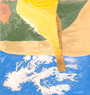
(the sky is not quite as aggressively blue as shown here).

The boat in the top aspect of the painting, seen below, Karl said, expresses the problem of painting realistically from a photograph. The boat is too real compared to the sketchy background that is supposed to represent reeds with a dune. Karl also disliked the smiley impression on ‘my’ face.
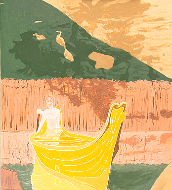
A final lesson was not to make the picture too tall. A picture has to be viewable on a small laptop. Looking at the canoe painting, as I scrolled it up and down on a tiny monitor of an Acer laptop at an internet café, Karl did not immediately grasped about the cloud images. Namely, that on the top, a cloud throws a dark shadow on the dune which then is reflected as lighter dark shadow into the water and finally, the white cloud and blue sky directly reflecting into the bottom aspect of the picture.

Karl and I then decided that I could improve the picture by filling in the background in the top aspect thereby removing the boat and then painting the boat again, less photographically accurate.

What sounded like a good idea in Germany, no longer felt right when I came home and looked at the actual painting. Looking at the yellow boat makes me feel good, gives me strength! As an aside, what had seemed a challenging time ahead on April 24th turned out to be significantly more challenging both in Germany and here in Michigan. To accomplish all the tasks that have accumulated requires that I clone myself, three copies and the original should be enough.

My emotions tell me to keep the current yellow canoe for feeling good. For the moment, I will also keep the silly smiley face.

Currently, I plan to fix the background – the reeds and dune – rather than the canoe so that all three will begin to harmonize in the top aspect of the picture.

I already followed one piece of advice that Karl gave me. I painted the 3/4 inch cradle of the Ampersand board dark green, not in oil but with viridian acrylic. Karl said that a dark frame will help me to paint the entire spectrum from white to black.

Having documented Karl’s critique that I am interpreting creatively, I now will return to my day job.
Texture of time

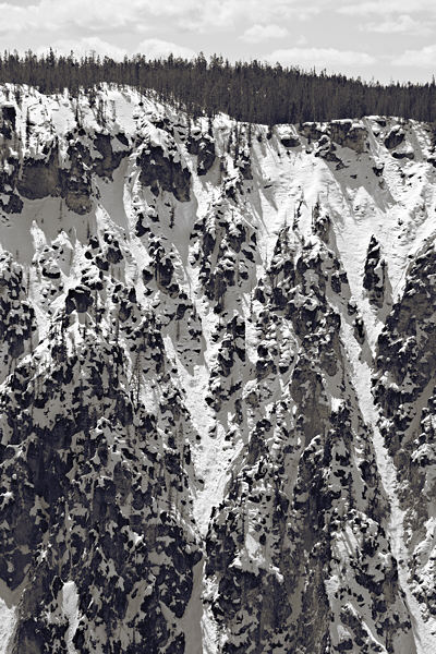
Continuing my recent Yellowstone visit after leaving the geyser basin, I headed for for the Canyon area. In the past I’ve tended to focus on the magnificent falls there. This year, extra deep snow made access to the best locations difficult (not to mention forbidden, though that’s of lesser concern). I spent my time instead looking at the steeply sloping walls of the V-shaped canyon carved by the river.

1

more… »

Two Tricky Concepts

A reference to a recent New Yorker Critic at Large (March 30th)  review suggests that a work of art is good if it rises out of necessity and if the artist is capable of carrying out the idea to its appropriate end. As a letter writer paraphrases:

“This matters; this has purpose” and “I can do this, I am able, I can carry out this task to its appropriate end” (correspondence from Joachim B. Lyon, Stanford, California, New Yorker, May 4, 2009).

I found these notions both bemusing and contra-indicated. What do you think?

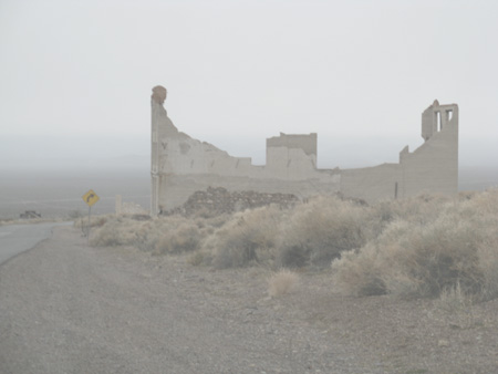
(Oh, and here’s an image from Rhyolite Nevada ghost town. I don’t know if it has either purpose or, if I paint it, as I intend to do, if I am adequate to the chore.)

css.php