Posted by Birgit Zipser on March 12th, 2010

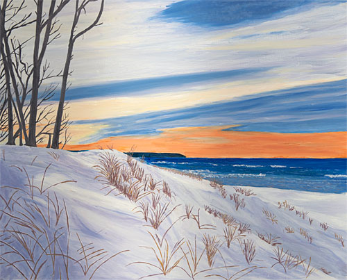
oil on maple panel, 40 cm x 50 cm
Improvised from a photograph this winter taken near Otter Creek in the Sleeping Bear Dunes.
Colors were mixed from Ultramarine blue, Manganese violet, Turner yellow, Chinese Lake, white and black. None of the mixtures displayed even the slighted hint of green.
Having gained some experience with choosing and mixing pigments, I consider, that a next, fruitful step in learning to be a better painter will be to follow Cennini‘s advice and practice drawing – daily.
Filed in painting
- Tags: dunes, water
- Comments closed
Posted by Jay on March 9th, 2010
It’s a nice coincidence that Steve and I should both be showing in libraries.
My son Matt, an employee of the Cleveland Heights/UniversityHeights Main Library, passed on the news that the library had prepared some gallery spaces in the old YMCA building across the street. I was urged to contact the appropriate people to get in line as an exhibitor. Before long I was summoned down for a confab to learn that I had a one man show in the offing and a month to get it together.
I had a few thematic options available including the chains, ladders, plastic, plaster and the various oddiments that have appeared on this site. However, some factors constrained my choices. For one, all available walls are equipped with hanging rails which limit the weight of mounted objects and which tend to be visually compromising. Furthermore, the one dedicated space has a low ceiling, limiting vertical dimensions. The other two spaces are a short wall in the computer room and a reading room which turns out to be the best exhibiting area. These are busy and I had to take into account their public nature. I didn’t want to install anything that would tempt people to mess around. On the plus side there is a lot of track lighting.
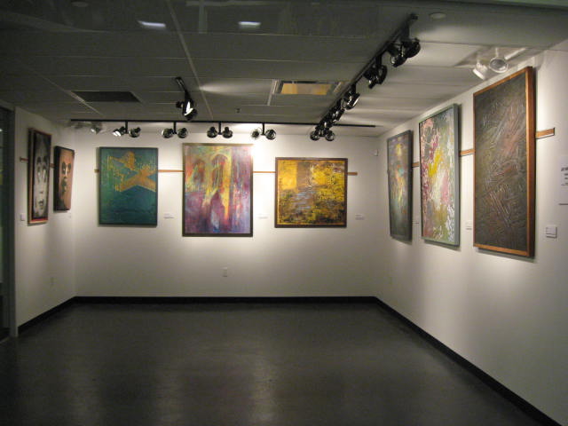
View of main gallery
more… »
Filed in Uncategorized
- Tags: show
- Comments closed
Posted by Jay on February 13th, 2010
The dreamings of the Australian aboriginines represent a kind of art that goes to the core of their identities. To the extent that that represents any kind of an accurate description, allow me to state that these images are at something of an opposite extreme in that they play around loosely with important documents.
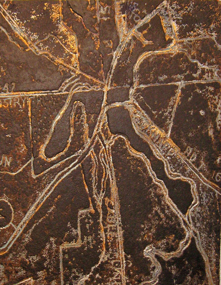
My initial impulse in doing maps was to effect some sort of transformation. A road map tells you what you, in your car, need to know about getting around. How about if the map were treated as a template through which other concerns were granted expression? There’s a lot to think about and do in this department and I feel that I have gotten so far as to dip my little toe so far.

This object is a straight-out gouge into a piece of particle board. It is derived from a map of Peninsula, Ohio, a picturesque village with bars, gift shops, but no place to buy a toothbrush. I was looking to produce the effect of a rather rusticated brass plaque.
more… »
Filed in Uncategorized
- Tags: map
- Comments closed
Posted by Birgit Zipser on February 9th, 2010

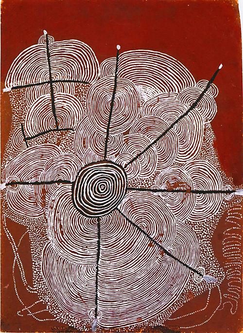
Children’s Water Dreaming 1972, 62 x 44 cm, Shorty Lungkarta Tjungurrayi
Aborigines used Australia’s wealth in ochre colors (iron oxides) to paint their mythologies on sand, cut bark of stringybark tree and their bodies. In 1972, acrylic paints and masonite boards were made available to a few Aboriginal men congregating in a ‘painting club’. While the usage of contemporary materials served to adulterate, it also helped to popularize Australian Aboriginal art. more… »
Filed in books,painting
- Tags: papunya boards
- Comments closed
Posted by Tree Smith on January 24th, 2010

Soutine with Dog
In Part 1 of this series, I wrote about how Soutine’s use of Christian imagery mixed with his life experiences, artistic influences and his own Jewish culture in his paintins, particularly his carcass paintings such as Flayed Rabbit from 1924. In Part 2, I uncovered beliefs and superstitions specific to the area where Soutine was raised, and how I believe they influenced his work, particularly the idea of the Angel Dumah and his fascination with death. Part 3 goes deeper into these ideas and how one painting in particular encapsulates them.
more… »
Filed in art history
- Tags: Soutine
- Comments closed
Posted by David on January 24th, 2010

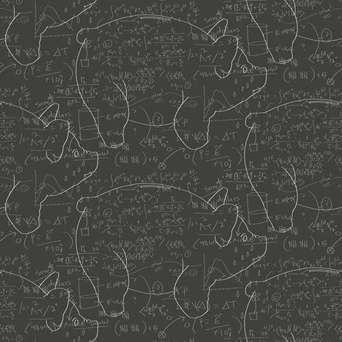
detail of wallpaper panel, 8 x 3 feet
I collaborated with my friends Jonathan Nodrick and Anita Modha of ROLLOUT Custom Wallpaper in Vancouver on a project that’s currently on view in Toronto. The exhibition, entitled Radiant Dark 2010, is on view January 21-24, and runs concurrently with the Toronto International Design Festival.
The theme for this year’s exhibition is Assets & Values. Our entry, entitled “Oh, That Explains Everything”, consists of 3 digitally printed wallpaper panels, each 8′ high x 3′ wide, that emulate chalkboard diagrams. The drawings, charts and formulas explain everything you would ever want to know about the economy.
more… »
Filed in Uncategorized
- Comments closed
Posted by Jay on January 21st, 2010
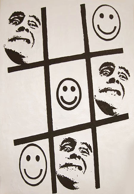
Tic Tac Toe was a mess. This 40″ by 56″ foam painting was colorful, but wrongly so. The smiley faces were in yellow, the mugs in violet and the grid in a mixture of the two colors, all set upon a motley background pretending to whiteness. With nothing to lose I blanked out the ground and blackened the figures. Most of the distractions are gone, allowing the basic question to be asked.
 more… »
Filed in Uncategorized
- Comments closed
