Posted by Sunil Gangadharan on October 4th, 2007
Cartier-Bresson once said on his turning from painting from photography “the adventurer in me felt obliged to testify with a quicker instrument than a brush to the scars of the world”. These are timeless words pregnant with effect and meaning. Of course, not that I am harboring plans of turning from painting to photography, but the simpler act of pointing at a scene and shooting at will to create an instant kaleidoscope of colors that pleasures your mind is a very enticing prospect. It is precisely this intention that I pander to when I point the trusty little Canon digital on my way to work at a certain Brooklyn shoreline early morning at about seven or so before the Staten Island Ferry makes its sojourn across the New York harbor to deposit bleary eyed automatons to their regular day jobs. I have been trying to capture the essence the shifting patterns of light by aiming the camera at the same spot every day. Day after day and the results are very enlightening and never replicated – so much so that I am almost compelled to paint from this fount of changing color combinations. The beauty of the ever changing cloudscapes playing subtle games on the ripples below is timeless. Sometimes the stern of an appearing boat only adds to the excitement. I hope to continue this side project of mine and report back in about six month’s time to see if the morning presentations duplicates themselves on this Brooklyn shoreline at least once.
I have samples from the last four days… more… »
Posted by Sunil Gangadharan on September 27th, 2007
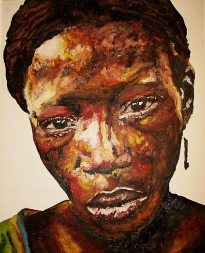
Sunil Gangadharan, ‘Battery’, Oil on masonite, 40″ X 44″
I have been exploring new ways of laying a face to the canvas and a technique that I am recently starting to understand is to pattern splotches of color rather than create defined areas of light and dark. It is a time consuming technique even if it looks very random. Previously, the light / dark areas seemed more deliberate and planned with the result that some of my older paintings had ‘islands’ which accentuated the lighting and lack of (no, I am not complaining, only comparing).
In this technique, I did not try and consciously paint ‘islands of light’. Rather, I developed the effects of light from using results of a higher valued hue playing on the transparency of the white ground overlaid with lower valued hues and thicker splotches of paint for completion of darker areas. So here are two new paintings and no contortional contretemps (as June playfully referred to questions/issues raised as a result of my posts).
Comments are most welcome.
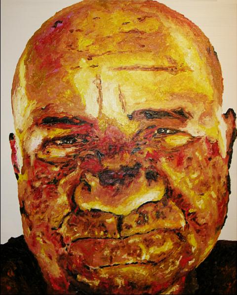
Sunil Gangadharan, ‘Belphegor’, Oil on masonite, 40″ X 44″
Posted by Sunil Gangadharan on September 21st, 2007
Some time back (2005) the BBC conducted a poll in England that asked people to pick out the most popular painting in their land. In a field crowded with van Gogh’s evocative pictures and Monet’s breathtaking impressions, the winner turned out to be a rather ordinary-by-today’s-standards painting by J.M.W. Turner titled the ‘The Fighting Temeraire’. Somewhat more surprising was the fact that the second prize also went to a similarly bucolic oil painting by Constable – ‘The Haywain’. (Arnolfini Portrait by Jan van Eyck was ranked fourth – one of my favorites) more… »
Posted by Sunil Gangadharan on September 13th, 2007
Recently, I embarked on a little mini project in a bid to better understand the vagaries of photography. I find photography a hard master and am still unable to photograph my paintings to the level of detail I want… This mini-project may just be regarded as another attempt at understating photography better. The premise was simple: Instead of turning the camera to outside subjects like “people, landscape, houses, family’, I decided to turn it inwards. I decided that I was going to photograph just objects in and around the confines of our home. What initially was envisaged as a dull chronicle of household items turned out to be quite an exciting one (at least for me).
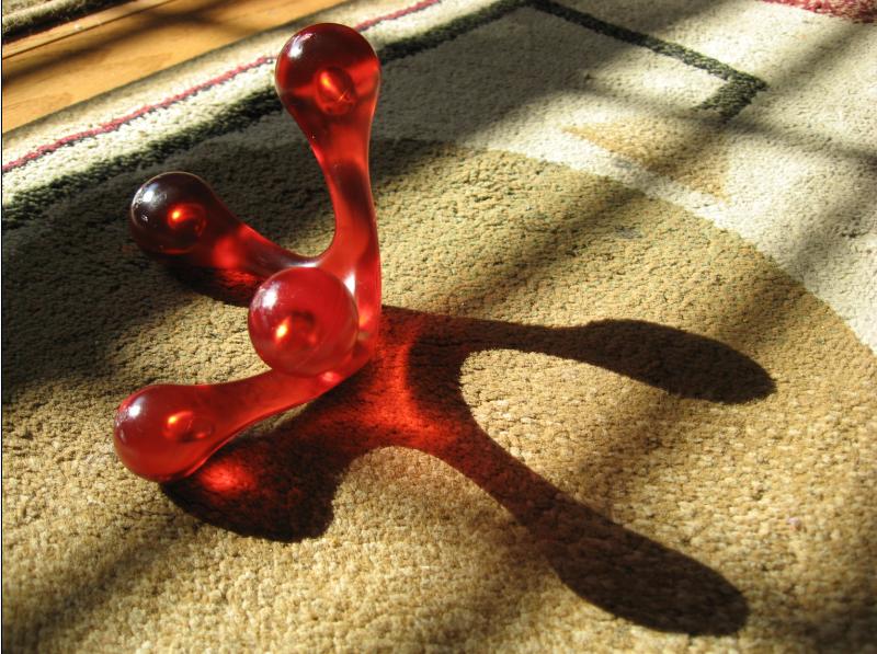
Sunil Gangadharan, ‘Juxtaposition’, digital photograph
I took about 50 pictures in a space of about two hours. All of them shot inside. I have posted a majority of them to the flickr site here. To see as slideshow click here.
So, instead of asking some serious art question (which I frequently find myself thinking more and more), I decided to take it easy and play.
Posted by Sunil Gangadharan on September 6th, 2007
I posted sometime back on living the art life and how it would be great to have one’s personality be in tune with art such that the art and person blossom to their fullest… I was thinking about the art life a lot after reading reports on art done by people of questionable backgrounds (some of whose victims are now demanding that the artworks be rescinded and not be considered works of art). more… »
Posted by Sunil Gangadharan on August 30th, 2007
Karl recently mentioned here that he prefers (and revels) painting in the context of his reaction to his surroundings. He averred to say that a photo of the landscape would not do justice because
“Photographs record what a place looked like at a particular moment. They don’t record what it felt like to be there”
My personal experience is a little different. more… »
Posted by Sunil Gangadharan on August 23rd, 2007
Color is a difficult thing to get your arms around. In fact I think one could spend a whole lifetime trying to understand this facet of art and become proficient in only a miniscule percentage of the approximately three million degrees of color difference that the untrained human visual cortex could distinguish easily. On the canvas, getting the right overall value of a particular hue such that the harmony of the whole remains preserved is rendered even more difficult given the reality that most oil paint companies make a maximum of about 60 unique hues of differing chromaticity. As I trudge through the long stairwell leading to my color nirvana, I have realized that there are two ways of approaching and understanding it. The approach is a bit dichotomous, but it seems to serve me well. more… »