Color is a difficult thing to get your arms around. In fact I think one could spend a whole lifetime trying to understand this facet of art and become proficient in only a miniscule percentage of the approximately three million degrees of color difference that the untrained human visual cortex could distinguish easily. On the canvas, getting the right overall value of a particular hue such that the harmony of the whole remains preserved is rendered even more difficult given the reality that most oil paint companies make a maximum of about 60 unique hues of differing chromaticity. As I trudge through the long stairwell leading to my color nirvana, I have realized that there are two ways of approaching and understanding it. The approach is a bit dichotomous, but it seems to serve me well.
I use two different schemes when it comes to color, the theoretical and the practical.
My theoretical cap comes on when I want to think about a hue, its tint or shade and its relationship to other hues in the color continuum. The practical dominates when I am holed up in the basement busy with a painting.
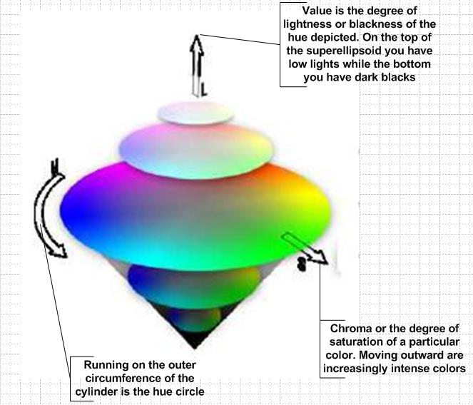
A useful way to think about color and relationships is the visualization of the Munsell color cylinder. I tend not to use the traditional color wheel as it does a poor job of letting you visualize the colors when presented in a continuum that we see around us in nature (plus I think it has outlived its usefulness a long time ago – again just my view). Without going into too much detail (you would find details of the Munsell scheme in the ever useful 1966 essay (“Color, Paint and present day painting” in Artforum) by Walter Darby Bannard), here is a brief overview of the color cylinder.
The Munsell cylinder is an extrusion of a modified color wheel consisting of five principal hues (no primaries in Munsell) with the circumference of the cylinder marked off with specific divisions of these hues, their intermediates and visual complementaries.
A little schematic that I prepared to understand the scheme sometime back.
The long axis of the cylinder specifies the value of the hue (specifically the lightness or darkness of the hue with a value of 0 at the bottom denoting black and a value of 10 at the top of the cylinder denoting white). In order to denote the saturation or the degree of intensity of a hue in this space, Munsell makes use of a superellipsoidal surface to model this cylinder to accommodate for the fact that some colors could have higher orders of saturation than others. Hence what we end up with is an elegant continuously-variable-radius cylinder that enables us to precisely locate and visualize naturally perceived color.
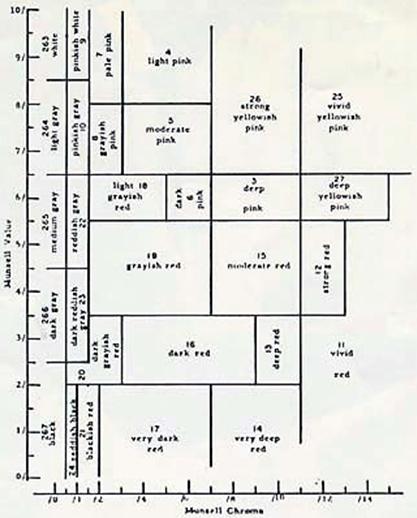
A vertical slice from the cylinder. Note the reds becoming pinks as we travel up the value scale in the cylinder. Note that the reason for the ‘bulge’ in the ellipsoid is due to higher numerical values on the chroma axis around the middle – so indicative of the natural world. Illustration ripped from the Munsell book.
Of course, it is rare that theory approximates practice. The Munsell superellipsoid cylinder does a poor job of telling you how exactly it is that you mix colors to attain a particular value or how it is that you adjust degrees of intensity to attain required levels of chromaticity. Oil paint being a little bit of a finicky medium makes this problem especially confounding. Oftentimes, I get a nice ‘mud’ color whenever I try and creatively mix paints to achieve a certain desired effect on the canvas. I try and attain a level of insight by obtaining a tube of paint that closely approximates the final mixed color combination that I would like on the canvas with minimal mixing. Of course, like I mentioned earlier, there are only so many unique hues of tubes of paint that I can choose from to get to where I want.
Given the practical difficulties combined with the little time that I have for my painting, I use a little bit of a simplified color scheme in many of my paintings that consists of what I might call a ‘reduced palette set’. As of now, I have managed to stabilize upon two sets of reduced palettes that get me to where I want in the final illustration. A reduced palette set in my view is the deliberate use of a small number of colors that will help you comfortably achieve the desired values and intensities for the hues used for the painting. Bear in mind that this might be a bit formulaic, but each painter can get to where they need to and find ‘reduced palette sets’ that could enhance their individual styles.
I have experimented with two sets (it takes about a year to study all the nuances that come with a particular subset of colors, but it is well worth the effort).
The first set is the one that I use for high-contrast-high-value paintings. Used to develop moods of melancholy in the subjects sometimes, while at other times a serious dourness.
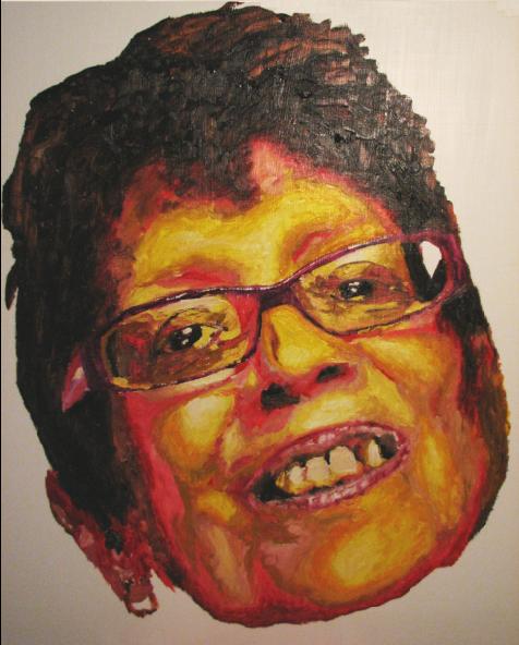
Sunil Gangadharan, ‘The inquiries never seem to subside’, Oil and gesso on masonite, 40″ X 48″, 2007 (painted from picture of a cancer patient getting ready to die)
The reduced palette set consists of the following:
– Raw Umber
– Burnt sienna
– Cadmium yellow deep
– Lemon yellow
– Yellow ochre
– Cadmium red deep
– Flake white
– Alizarin crimson
Most of the shades and tints can be comfortably achieved by minimal mixing with white or Mars black as the case for the value level appropriate for the area in the painting. Of course, blending the transitions between colors on the canvas also helps develop additional harmonies.
The second reduced palette set I have been working on (of late) is the one I developed for lower value paintings that help develop a mood of bathos and nostalgia.
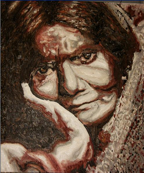
Sunil Gangadharan, ‘Rasa’, Oil and gesso on masonite, 40″ X 48″, 2007
The reduced palette set here is as follows:
– Ivory Black
– Titanium White
– Indian red
– Raw umber
– Burnt sienna
In a self portrait I had done recently, I decided to venture into the viridians and blues, but decided that I was not experienced enough to sally forth.
The reduced palette helps me put to the canvas what I can theoretically visualize using the Munsell color space described. For me, it is a happy marriage of practicality mixed with the necessary visualizations needed.
How do you visualize color? Do you use any similar color schemes in your paintings and photographs?

Sunil,
I’m fond of nickel-titanium yellow. It’s a solid yellow without being overwhelming like the cadmiums, good company for the earth yellows.
I think you are using the different palettes to good effect. It reminds me a bit of Bosch’s different color schemes for the inner and outer panels of a triptych.
These are powerful paintings. I’m trying to image the impact of the full sized images!
Impressive paintings!
Sunil, I think of Munsell and other color-ordering systems as kind of an inventory of the range of perceived color. Kind of like a list of every item available in the grocery store (put into categories of course). It’s good to know what’s there in the store, but it doesn’t help you prepare dinner.
I tend to think of color mixing and color choice as two separate problems. Though there are not rigid boundaries between the two, as I’ll sometime mix up a range of steps between two or more colors on my palette to work with. Pretty much any color can be mixed given the right primaries. Choosing what color to put in a specific area of your painting is a whole other issue.
The person I studied color theory from in grad school had been a student of Josef Albers. We did color exercises by cutting and collaging colored paper from a pack of ColorAid paper. It really helped open my eyes as to the range of possibilities in using color, and also to the relativity of color perception – the fact that our perception of a color is totally dependent on the other colors surrounding it.
PS – Liquitex used to put out a very useful color mixing guide. It showed how you could mix any color from a variety of different starting points. It looked like a big chart, with color chips. Not sure if it’s still available.
PS – I dug around in Ggogle, and I think this, is it, or includes it anyway.
Karl and Birgit,
Glad you enjoyed the paintings. This post came as a result of me trying to clarify my thoughts on color and someone asking me the other day a question about color selection in my paintings and if I saw the world this way….
Dacid,
“the fact that our perception of a color is totally dependent on the other colors surrounding it”
Yes, that above statement regarding color perception is a key fundamental to starting off – you put it well. I liked the store / dinner analogy also. It makes it clearer for me.
I read about Liquitex – maybe one of these days I will go ahead and try it – it seems to get some good reviews (I read about it in another online forum about painting)…
Sunil,
I like the looks of your reduced palettes. If you took the last picture — a great one — even further, it would correspond to the toning I do on “black and white” photographs. In fact, almost none of those I have presented here are neutral shades of gray. In the previous post, for example, the darkest tones are shifted towards blue and the midtones toward orange. Color is so powerful that even a little goes a long way.
Don’t know about the technical aspects of color/paints. Had to create a grayscale once and it was hard work.
Love the paintings of course. Your use of burnt sienna/raw umber reminds me of Rembrandt, another great painter of faces.
Sunil:
Allow me to add my voice to the choir of huzzas. Have you scheduled your one-man show at the Tate yet?
Your cancer patient is so insightfully colored. The final hours can be like that. My father’s forehead was ablaze with fever the last time ever that I touched him. Your image thereby takes me both back and aback.
In answer to your question, I muddle by. The fact that I’m fond of transparent and translucent glazes puts the matter of color on a different footing. Such glazes filter each other with the base hue modified by succeeding layers. Green, for example, can be a matter of mixing a pigment into the varnish. Or it can be achieved by a layer of blue, say, covered by one of yellow – or the obverse. But, granted the same pots of varnish, yellow over blue can be a very different creature from blue over yellow.
The degree of dye or pigment saturation in the varnish is another significant variable.
This said, and being the slob that I am, a technique that I call splash, slosh and wash seems to work best for me. Sometimes I will revert to the sinister sounding “drip and run” approach. In these scenarios whatever I can squeeze out of a tube or scrape from the bottom of a can becomes the color of the moment. How dare I presume such outrage? I think the answer lies in the fact that I have no particular color objectives when I set out. It’s all a big surprise. Occasionally I can repeat an effect. However, to save effort, I have had my fingers surgically crossed.
This works for me, though. I have found that an incised and roughened surface will selectively pick up the paint that I may be applying with my fingers or a slab of foamula. Repeated applications hit different high points leading to patterns of hue.
But, sir, as you set out your work, so shall I. Henceforth I foreswear the crude application of color and will endeavor not to so blindly reach into the paint box. But I can’t guarantee a thing as talk is cheap.
Jay,
Thank you for your comments on the cancer patient. The lady fighting it seemed an especially brave one and I was very compelled to hear her story.
It is difficult hearing about loss and it is thus I react to yours.
Your approach to painting seems a lot more ‘spur of the moment’ when it comes to color usage and that yields wonderful results – done right.
Yes, glazing can be powerful tool to introduce translucency into a painting. Sometimes I achieve the same by dabbing on a thick layer and then just applying an old rag to the painting and stripping off just enough to show the layer underneath. Oftentimes I am not careful and it goes down all the way to the gesso.
Hey,
Graydon Parrish, Richard Murdock and others have started a blog on painting with the Munsell System. I think that they are Graydo’s secrets.
Go to http://www.rationalcolor.blogspot.com
http://www.dudeverve.blogspot.com is also a must!
I wandered back here because of the recent comment by Salley Dulley and was again impressed by the amount of information and knowledge that this list puts forth. Thanks, Sunil.
I keep fussing with and about color, both theory and practice, but like Jay, I find it difficult to be systematic. I think I should be, but at best, I circle and come closer to a system.
That said, doing pleine aire work requires as light a weight to carry as possible, so I have been painting with Alizarin crimson, cadmium yellow light, ultramarine blue, mixed white and perylene black (which is really a black-green). In eastern Oregon I often had to add naples yellow. And I’m thinking of adding veridian to my western Oregon palette. But the reduced palette, as Sunil says, has interesting side effects that I find useful.