[ Content | Sidebar ]

Archives for technique

Two paintings, two challenges

On Monday, I painted two plein aire oils from the uppermost level of a parking garage. On Tuesday I attended a crit session with some other painters that I meet with regularly. OF course, I showed them the paintings.

I managed to remember to photograph the first painting twice — once as it emerged from the garage session, and then again after I had been through the critique and had tweaked it in the studio. I didn’t do a lot to this  painting in my second go-round, but when I finished I was concerned about the loss of some of the “naive” quality of the red building. Here are images of the two versions:

Library Parking Garage, View South (first draft) 12 x 16, oil on board more… »

Comparing Media: Intaglio, Quilting, and Language

In a recent critique session of quilted art, conducted by two “fine” artists, I found myself having a “eureka” moment. Then, a few days ago, Jay and Melanie’s discussion of Jay’s intaglio technique on board and foamcore (published prior to this post) pushed some of my insights a bit further. All this was added into a melange of thinking I’ve been doing about where I am in relation to quilted art and painted art.

The eureka moment came through the phrase used by one of the fine art critics: the phrase was “working the surface.” “Working the surface” in the traditional fine arts means adding, deleting, scraping, underpainting and overpainting, sanding, gouging — all the kinds of things one can do that either uncover and/or add to a planar surface. It seems clear to me that Jay’s process of working his boards and foamcore are fine examples of “working the surface.”

With quilted art, “working the surface” seems to show up in two ways. One is what is called “surface design,” which basically alters the flat plane, by dyeing it, laying rust on it, discharging (bleaching) it, monoprinting on it, and even digging into it, tearing and unraveling the threadwork. This work sometimes adds texture (especially with elements applied to the surface (applique) or taken away from it (“cutwork” or just plain gouging holes). These kinds of working of the plane are singular, patterned for the effect in a particular work, not meant to be turned into a commercial design for fabric (the original use of “surface design” had a strong commercial element.) The other part of working the surface with textiles is the work of embroidery and quilted lines that make for a frieze effect; when stitches are pushed through the two layers of fabric and the in-between batting or wadding, the stitched line makes an indentation, beside which the surface becomes raised by the pushed-aside materials.

I have never heard the phrase, “working the surface” applied to quilted art before, but when I heard that and then saw the intricacies of Jay’s working of his surfaces, I realized that the language may give me new insights into what can be done with quilted art.

At the critique, the guest “critics” (very kind observant folks) looked at two pieces I had brought, comparing them.

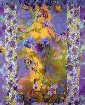
The first was one you’ve seen before: Mrs. Willard Waltzes with the Wisteria, 76 x 61″, 2003, hand dyed and painted cotton, embroiderie perse with computer-generated prints, and dyed overlays.
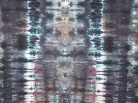
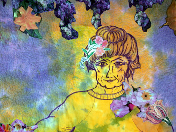
mrswwaltzesw.jpg

mrswwaltzesdetw.jpg detail

more… »

Things to Chew on: ruminations from Basin Montana

Here at the Montana Artists Refuge, I find myself limited to the materials and ideas at hand. In Portland, I have access to two physical locations of Powell’s books as well as various used book stores and the big national chains. I also am within easy travel distance of four large art supply stores. Delivery of online orders is fast and easy. In Basin Montana, none of the above are present. So I have to make do with what I have available to me. And what I have available is sometimes just eccentric enough to be more than merely useful.

Along with my Phaidon biography of Cezanne (by Mary Tompkins Lewis) and a Dover book of Durer’s Drawings, I brought a copy of Gregg Kreutz‘s Problem Solving for Oil Painters. The book resides in my studio where I thumb through it when I need to rest my fingers and arm and eye from the physical act of painting.

apkreutz-450.jpg

I’m not recommending (and yet not not recommending) the book exactly; Kreutz is a bit too dogmatic for my tastes. Yet he does give me some things to push off from. more… »

The Line, as Quilted

As an oil painter who tends toward “moosh” rather than clean graphic edges, I have found myself pondering the stitched line intrinsic to my quilted paintings. They change the moosh that I so often fall into, adding a different set of visual ideas.

So, if you’ll forgive me, I want to explore notions of line — line mostly as it is generally described and discussed in design classes, but more particularly as it works in quilted art. [ed. note: This turned out to be more of an essay than I had intended. If you wish, you can just look at the pretty pictures.]

linepaintedhillsbluffwip.jpg
Painted Hills Bluff, detail (Work in Progress)

Line is important in design, particularly, of course, in drawing. It moves the eye, evokes feelings, defines or suggests shape, can make value and depth, and can be varied to vary its expressive quality. In quilted art, line functions in all these ways, but can have a weight and value different from that found in drawing and is far more inportant than line is in painting. In conventional photography, line seems to have minor function, but art photography often makes extensive use of line.
more… »

How I Stop and Start Something New

DaydreamerThis is the end product of a demo I posted on another site. The process I used was to do a series of acrylic washes until I thought I knew the person I was looking for in this painting. Then started to build in oil, leaving some of the acrylic visible. I kept from moving away from my original idea by avoiding the urge to make everything perfect. I thought about making the hand smaller or detailing the neck line of his T-Shirt, but it remained just a thought. I had the feeling that I was done and it was time to move on to something new.

Color and oil paints – I

Color is a difficult thing to get your arms around. In fact I think one could spend a whole lifetime trying to understand this facet of art and become proficient in only a miniscule percentage of the approximately three million degrees of color difference that the untrained human visual cortex could distinguish easily. On the canvas, getting the right overall value of a particular hue such that the harmony of the whole remains preserved is rendered even more difficult given the reality that most oil paint companies make a maximum of about 60 unique hues of differing chromaticity. As I trudge through the long stairwell leading to my color nirvana, I have realized that there are two ways of approaching and understanding it. The approach is a bit dichotomous, but it seems to serve me well. more… »

Ruminations on Pigments, Dyes, and Temperaments

wholeclothbluebrownw.jpg

In an interview for a quilting magazine recently, I was asked why I liked oil paints. I found myself speaking lovingly about the names of paints — burnt sienna, cadmium yellow, quinacridone magenta, perylene black, French ultramarine.

My response surprised (even) me. I hadn’t actually thought of the names of colors as a reason to like a specific medium. Thinking it over, however, I came to understand why I fell into praising the precisely designated oil paints. And watercolor paints. And even acrylics.

It isn’t the names, charming as I find them, so much as it is that the names signify a specific color that holds fairly true across media and brands.

To understand the hold that standardized pigments have for me, you have to know that I began my color education with textile dyes rather than pigment paints. Once you have struggled with making art with dyes, you find that using pigmented paints seems ridiculously easy.

Here are reasons why dyes are inherently difficult to control.

more… »

css.php