Posted by Birgit Zipser on July 14th, 2011

Birgit Zipser, watery fantasy, 11×14 inches, oil on panel
‘What I learned when I learned to draw’ by Adam Gopnick, The New Yorker, June 27th, discusses Jacob Collins‘ approach to drawing, which involves perceptual rather than conceptual viewing. The idea is to disengage from drawing symbols – conceptual schema of an arm or a face – and draw what you actually see. What you actually see may be a funny shape, a frog or an outline of a new African state, due to the play of light and shade on the body of the model. Thus, Gopnick was guided to learn to draw by ‘searching for strange shapes to break his symbol set’.
Jacob Collins in his “traditional realist revivalism” paints nudes, still lifes and landscapes. I may understand how the artist can draw a person modeling for him or cherries in a bowl by searching for shades and shapes rather than by using conceptual symbols. But doesn’t this approach break down when landscapes are drawn that contain water?
Water does not hold still for the slow musing approach to drawing that Adam Gopnick tells us Jacob Collins uses. My question is does Collins paint water using his symbol set of water?
Posted by Birgit Zipser on June 24th, 2011

Blauer Fetzen, Birgit Zipser, oil on birch panel, 24 inches x 18 inches
The speakers of the last two talks at the Glen Arbor Art Association – Michael Letts on June 9, 2011 and Rachel Meginnes on June 23, 2011 – had things in common.
Both Michael Letts and Rachel Meginnes focus on geometrical patterns – Michael paints landscapes in abstract symbols and Rachel paints geometric shapes on cloth.
Both artists professed a zen-like attitude towards, what one may consider, tedious tasks. Michael paints ‘marks’ on his large geometrical sketches achieving a fabulous 3-D effect with shadows and highlights. Rachel, to generate the orthogonal grid underlying her painting, pulls threads out of fabric, usually cotton.
It was inspiring to listen to both discussing further development of their art – Michael Letts is experimenting with new motifs and Rachel Meginnes is developing a novel technology in fiber art.
Geometry and meditation are an ancient combination, an example are Mandalas, while the quest to developing new forms of art is an individual expression rather than one based on ancient belief systems.
Posted by Steve Durbin on March 16th, 2010
In Praise of Trees is the name of my show with printmaker Kerry Corcoran, which opened about a week ago at the Bozeman Public Library. The Atrium Gallery is essentially the combined entrance halls from two sides of the new (environmentally-certified) building, resulting in a broad, L-shaped space intended for exhibitions. It does get lots of traffic, though much of it under 12 years old. We applied and were accepted over a year ago.

more… »
Posted by Angela Ferreira on October 18th, 2009
It wasn’t until mid Renaissance times that anyone other than the church was wealthy enough to afford decorative commissioned paintings. People wanted to show their wealth by asking painters and sculptors to do this.
Roman Art was almost as wallpaper, it covered most of the interior walls, outdoors murals, shop walls and ceilings.
Art form then, was a service to others, a technical skill brought into your establishment with limited individual freedom. Nevertheless, many artists while working for the church and patrons would also benefit from food and bedding as guests while executing their assignments.
In contemporary times, artists are given an assignment and we often pre-negotiate payment, theme, color scheme, size, etc…
Has the artist possess limited freedom in their work? What are the personal benefits besides the payment that an artist accomplishes from a commission that moves away from the individual style?
The challenge is that an artist has to re-think their work outside their ‘safe-comfort zone’ and create pieces that satisfy the commissioner as much as themselves.
I personally found this a very enjoyable journey for a professional artist. These five paintings shown here are an allocated comission to Novotel Hotel in my local zone.
After given a brief, I have walked to my studio thinking, researched and re-invent some artform that would still fall in to the client’s expectation and of course carry on my style signature. A challenge that I have truly enjoyed with the added bonus of discovering a new facet to my developing art skills.
Is a traditional artist an ego seeker? What is an artist true goal when producing art, is it their own fulfillment, or is it the rewarding enjoyment of public/patrons approval?
-

-
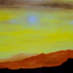
Sunrise – Oil on painting paper
-

-
Sunset – Oil on painting paper
-
-
Sunshine – Oil on painting paper
-
-
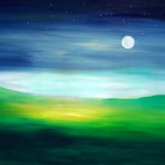
Moonrise – Oil on painting paper
-
-
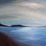
Misty – Oil on painting paper
Posted by June Underwood on October 16th, 2009
The phrase, “Sloppy Craft”, the title of a recent panel discussion and a forthcoming exhibition at Portland’s Contemporary Crafts Museum, had to be checked out. Whatever could it mean? How could the Contemporary Crafts Museum have been drawn into featuring sloppiness? What kind of provocation was intended by the title? What are the implications of honoring such a concept as sloppy craft for art as well as craft? Tell me more, tell me more.
A bit of background: when I was working textiles, I regularly engaged in a “discussion” with quilters (some traditional, some contemporary) about whether the stitching work done on my textiles ( specifically in construction and quilting) should strive for perfection. I always maintained that my goal was “competence.” My attention was entirely on the image and impact (on, I maintained, the art). The craft was there only to hold it together and/or to add to the art. Hence my seams were not necessarily straight and the back of the art was decent but not flawless (I didn’t bury my threads, for example, simply tidied them). I used the quilting stitches as part of the design, which meant that they were generally not even in length and that they were heavy in places and light in others; this can make the quilted art hang wonkily, requiring heroic measures to make it perform well.
This is an example of a old piece of mine that I claim has “competent” craft:
 Sophie, Emerging, 84 x 73″, 2002, Materials: hand-painted cotton, canvas, silk, stretch-polyester, felt. Methods: hand- painted-and-dyed, airbrushed and commercial fabrics. Machine stitched.
more… »
Posted by Birgit Zipser on September 28th, 2009

20 x 30 cm detail from ‘Longing for Pondicherry’, Linen on wood, 70 x100 cm, in progress
Hanneke van Oosterhout just emailed me a detail from her latest painting showing a watermelon resting in an earthenware bowl. When I first discovered Hanneke, she was painting roses. I am able to admire one of them because it graces my dining room. Hanneke’s painting shows a yellow rose standing in streaming water while stretching upwards, both lovely and powerfully, with one of its leaves fluttering downwards. more… »
Posted by June Underwood on September 19th, 2009
On August 23 I finished the seven-panel plein air oils of The Diamond Grade. On September 10, I’m still working on putting together a small card with a fold-out version of the panorama. This is a project I thought to complete in a couple of hours. Instead, it’s taken weeks.
There was the question of the size of the images. And the paper onto which they would be printed. And which printer. And then it was clear that without some kind of cover, the images, folded into rectangles, looked a bit like the notes I passed to friends as a sixth-grader. So I had to find a cover. And then the images sprang open inside the cover, so I had to find a way to fasten the cover, a way which could be undone and redone, without too much damage. I had a bunch of Moo cards that I am currently enamored of that I wanted to include somehow.
Here’s the photo essay of the process:
The original strip of images:

After trying out samples of 3″ and 4″ sizes on my HP ink jet printer and 2″ sizes on my Epson pigment printer, which actually could handle up to 24-inch wide strips, I decided to go with Kinko’s laser printing service.
more… »