Thinking that learning to draw the human figure might help me drawing the soft shapes of Michigan’s Sleeping Bear Dunes, I took lessons at springstudiosoho.com for the last few months. With charcoal on a 24 x36 inch pad, I drew poses that were held from 1 to 20 minutes. For the 20th anniversary of the studio, the drawing below was exhibited. Minerva Durham’s comment on taking the picture was: ‘You have moments’ which made me feel wonderful.
Archives for drawing

Sloppy Craft: It’s Getting Interesting….
The phrase, “Sloppy Craft”, the title of a recent panel discussion and a forthcoming exhibition at Portland’s Contemporary Crafts Museum, had to be checked out. Whatever could it mean? How could the Contemporary Crafts Museum have been drawn into featuring sloppiness? What kind of provocation was intended by the title? What are the implications of honoring such a concept as sloppy craft for art as well as craft? Tell me more, tell me more.
A bit of background: when I was working textiles, I regularly engaged in a “discussion” with quilters (some traditional, some contemporary) about whether the stitching work done on my textiles ( specifically in construction and quilting) should strive for perfection. I always maintained that my goal was “competence.” My attention was entirely on the image and impact (on, I maintained, the art). The craft was there only to hold it together and/or to add to the art. Hence my seams were not necessarily straight and the back of the art was decent but not flawless (I didn’t bury my threads, for example, simply tidied them). I used the quilting stitches as part of the design, which meant that they were generally not even in length and that they were heavy in places and light in others; this can make the quilted art hang wonkily, requiring heroic measures to make it perform well.
This is an example of a old piece of mine that I claim has “competent” craft:
 Sophie, Emerging, 84 x 73″, 2002, Materials: hand-painted cotton, canvas, silk, stretch-polyester, felt. Methods: hand- painted-and-dyed, airbrushed and commercial fabrics. Machine stitched.
New perspectives: Oakes & Oakes
Lawrence Weschler has a delightful article in the Virginia Quarterly Review on the work of the young twins Trevor and Ryan Oakes. They are very original and persistent thinkers about how we see and the consequences for art. For example, though we’re seldom aware of it, our nose intrudes in almost half the visual field for each eye. This may be subliminally responsible for the claimed common appearance of roughly triangular shapes in the lower parts of pictures. (I haven’t attempted to confirm this, but it’s something I’ll be looking for in future, especially in abstract art; ask me again in six months.)
Most of the article is about a novel approach to rendering perspective, something that June particularly has discussed on A&P. Her prime example of Rackstraw Downes is another artist especially concerned with the wide peripheral vision, like the Oakes twins. The technique is essentially spherical projection combined with independent focusing of the artist’s two eyes, one on the scene being depicted and one on the paper being drawn on. The brain’s binocular vision, attempting to deal with this abnormal input, essentially overlaps the two views, so that the artist can “simply” trace with a pencil the scene that appears to be on the paper. I’ve tried this enough to see how it works, though it would clearly require practice and patience to keep it up. And it can only be achieved for a smallish angular range. So the brothers constructed a frame (see the article) which allows them to build up a panoramic image by building it up bit by bit.
Green therapy, mud sketching on recycled paper!
The weather is been fantastically good, so in order to give an art lesson outdoors to the kids and enjoy the sunshine, I have taken them outside in the school playground/pound area for painting.

By dipping a paintbrush in the water pound, and mixing it with soil, you can create beautiful earthy shades, pretty much the same principle as watercolour.
By breaking grass and smudge it on paper you can make a shade of green, and by using a burned wood stick you can create some chalky black. Using only these natural pigmentations from nature you can create 100% organic art on recycled paper.


I have made two organic sketches, one that I prepared at home in my back garden and another one I used for a quick demonstration how it works for the kids.
Here are some of the results:

Age 9

Age9

Age9

Age 10
For more school art lessons check out my blog at Life of a Mother Artist
More to come…
Texture, the Internet, and Other Conundrums
I have just joined Facebook (thanks, D.) and of course, instantly found a group dedicated to a textile artist’s focus: namely, texture.
The photos of “texture” on the group site were close-ups, both of quilted fabric and of objects that showed as textured. I started through my photos and quickly realized that deciding on what shows texture is not as easy as might be imagined. Here are some possibilities from my files.

The High Note, JOU, Computer images on Silk, quilted, 12 x 12″, 2008.
The upper layer (of computer-printed sheer fabric) is turned back to show under layer. Normally the sheer would fall over the entire piece, showing through as it does on the right bottom. This dropping of the sheer obscures much of the texture while at the same time, contradictorily, adds to it.

Vilhelm Hammershoi, Sunbeam (and various other titles), 1900, oil on canvas.
Rain and Sun: more on edges
I am continuing to re- and re-read Schmid’s chapter on edges, because I’m not sure I have a decently full grasp of what he’s saying.
The book is Alla Prima: Everything I Know About Painting by Richard Schmid ($50 USD in soft cover from him; more from Amazon and more in hard cover).
Schmid begins his chapter by saying “Think about edges the way you would think about kissing someone…. Think of edges as exquisite subtleties, as the means to transmit romance, as ways to make your dabs or paint whisper or shout and reach nuances beyond the range of color. Think of them as visual poetry… but especially think of edges as you would the agents of expression in music….pianissimo (very soft), andante (flowing), allegro vivace (fast and lively), maestoso (majestic), fortissimo con sforzando (whamo!).
Drawing on complexity
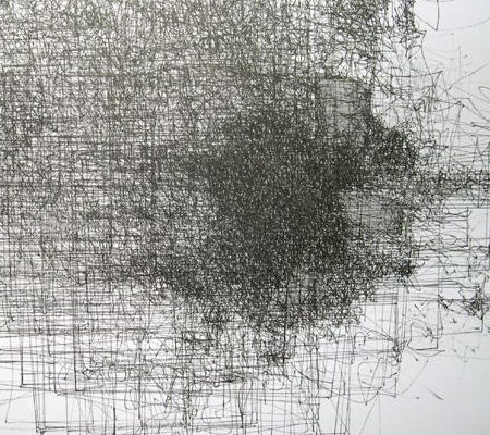
Complex #4 (detail), Nelleke Beltjens
There was a fascinating exhibit in Bozeman of drawings by three young European women–Nelleke Beltjens, Hedwig Brouckaert, and Jorinde Voigt–curated by independent art historian/critic/curator Peter Lodermeyer. Titled re/pro/ducing complexity, the multiple readings of which are all applicable, it consists of recent work that is varied, visually appealing, and intellectually stimulating.