Posted by June Underwood on January 18th, 2008
On a windy frigid Wednesday this week, Jer and I visited the Archie Bray Foundation in Helena, Montana. The visit was frigid, fascinating, and raised some internal questions for me.
The Archie Bray is a ceramics workshop, foundation, and clay business, started by a brick manufacturer who was fascinated by art ceramics. According the website, the Archie Bray was founded “in 1951 by brickmaker Archie Bray, who intended it to be ‘a place to make available, for all who are seriously and sincerely interested in any of the branches of the ceramic arts, a fine place to work.’ Its primary mission is to provide an environment that stimulates creative work in ceramics.”
more… »
Posted by Sunil Gangadharan on August 23rd, 2007
Color is a difficult thing to get your arms around. In fact I think one could spend a whole lifetime trying to understand this facet of art and become proficient in only a miniscule percentage of the approximately three million degrees of color difference that the untrained human visual cortex could distinguish easily. On the canvas, getting the right overall value of a particular hue such that the harmony of the whole remains preserved is rendered even more difficult given the reality that most oil paint companies make a maximum of about 60 unique hues of differing chromaticity. As I trudge through the long stairwell leading to my color nirvana, I have realized that there are two ways of approaching and understanding it. The approach is a bit dichotomous, but it seems to serve me well. more… »
Posted by Steve Durbin on August 8th, 2007

OHIO TOWN – varnish on figured foam – 2005
You, especially if you patrol the aisles of building supply stores, have run across sheets of a light, pink material, used for insulation. Foamula is a common trademark.
more… »
Posted by June Underwood on July 6th, 2007
In an interview for a quilting magazine recently, I was asked why I liked oil paints. I found myself speaking lovingly about the names of paints — burnt sienna, cadmium yellow, quinacridone magenta, perylene black, French ultramarine.
My response surprised (even) me. I hadn’t actually thought of the names of colors as a reason to like a specific medium. Thinking it over, however, I came to understand why I fell into praising the precisely designated oil paints. And watercolor paints. And even acrylics.
It isn’t the names, charming as I find them, so much as it is that the names signify a specific color that holds fairly true across media and brands.
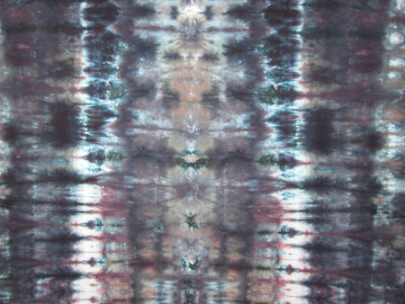
To understand the hold that standardized pigments have for me, you have to know that I began my color education with textile dyes rather than pigment paints. Once you have struggled with making art with dyes, you find that using pigmented paints seems ridiculously easy.
Here are reasons why dyes are inherently difficult to control.
more… »
Posted by Leslie Holt on June 20th, 2007
The “tradition” of using non-traditional materials and found materials in art goes back awhile – from Braques and Picasso’s collages to Duchamp’s urinal. By now we are accustomed to seeing everyday things in the museums or galleries For me, the use of non traditional or found materials has to transform that material so that it becomes something else than the novelty of the material itself. A couple of artists came to mind when thinking about this today. I recently discovered and artist named Il Lee.
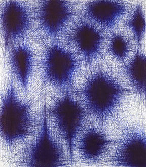
BL-069, 2006, Ballpoint pen on canvas, 48 x 42 inches more… »
Posted by Karl Zipser on May 30th, 2007

Painting
From Life vs.
From Photos
Tinting paper is the fastest and least expensive ways to ‘make’ paper. One begins with a ready-made sheet, but then makes it one’s own. more… »
Posted by June Underwood on May 11th, 2007
Goose Rock Panorama, 2007, Cotton and watercolor, in progress
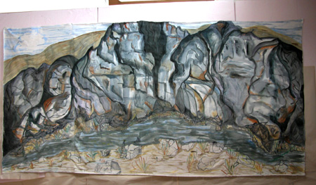
I’ve been thinking about the planes on which we work, that is, the stretched canvas, the photograph, and the quilted textile. This is partly in response to my interest in analyzing quilted textiles vis-a-vis more traditional media, say, oil paintings. But my thinking has also been triggered by some reading I’m doing; I’ll reference the readings at the end of this post.
With stretched canvas, some questions revolve around how the picture plane is used (as a window, as a flat surface, or extended out into frontal space and rounded so there’s a back side to the image.) more… »