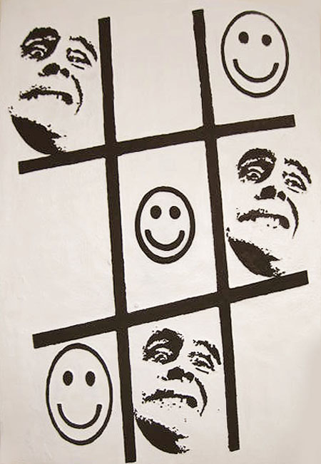
Tic Tac Toe was a mess. This 40″ by 56″ foam painting was colorful, but wrongly so. The smiley faces were in yellow, the mugs in violet and the grid in a mixture of the two colors, all set upon a motley background pretending to whiteness. With nothing to lose I blanked out the ground and blackened the figures. Most of the distractions are gone, allowing the basic question to be asked.
Archives for Uncategorized
A Little Help Here
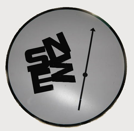
Parked about the place, doing a slow burn, has been a dubious project. It is a deconstruction of sorts wherein an ordered and functional format is scrambled.
It contains the elements of a compass including a round face. The letters designating the cardinal directions, however, are congregated in a pattern that is more self-referential than indicative of a greater orientation. The needle sits idly by, with no particular functional opportunities, or sense of direction.
Post-Painting Depression
I’m back in Portland, Oregon, from my six-week Nevada sojourn. But I haven’t unpacked my big linen canvases yet. I am almost afraid to do so, fearing that they are completely banal, hence total failures (banality is worse for me than bad).
In part, this reluctance has to do with various coming home challenges — burst pipes, unreliable contractors, relatives using the house in unexpected and unnerving ways. But in part, it’s simply because I don’t know what I did, although I am fairly certain I did not manage to un-orient, and my feeble attempts merely feel like they may be so feeble as to look feeble-minded.
Well, you see where I am. I began last February and March, 2009, living with the desert and Beatty, Nevada, painting small masonite panels, getting to know the territory and its inhabitants. This November sojourn, however, was more limited and almost entirely devoted to the Amargosa, which became more and more fascinating as I spent 6-8 hours a day, alone with the scene, for the full month of November.
So here are photos of the seven panels, plus the full panorama. These were taken as the panels were still on the wall of the Red Barn, under under limited lighting conditions. The exception is the full panorama, which was lit andphotographed by professional photographer, David Lancaster.
I am showing these in part to bolster my own sense of dignity and/or bravado.
 Unoriented Amargosa (panel 1, east), 4′ x 5′, oil on linen, 2009
Still Here
Months have passed since I posted anything. Like others I have been distracted by a number of competing priorities, but have kept my hand in as much as possible.
The affair with plastic as a medium continues – in fact has perhaps gone over the edge a little bit – as I buy all manner of absurd plexiglass which now threatens to take up all available space.
My initial work with plastic in trying to put out a clean product, continues. Added to this are experiments with a happy-go-lucky kind of drape forming, which is something of an antithesis, or complement, to an otherwise obsessive concern for smooth surfaces and clean edges. The drape forming is a primitive exercise in laying plexiglass sheeting over a variety of shapes and blasting it with a sizable propane burner. The plastic sags and bubbles in the flame and assumes some semblance of the underlying structure.
In this instance I obtained a waffle pattern from an old louvered door. Some colored varnish was dropped into the grooves. When this had hardened I then painted the back in silver. While nothing in particular was anticipated with the exercise, I found a hybrid effect that recalls a sort of medical metallica interspersed with a sense of bubble-wrapped bodily fluids. Sometimes keeping to an intended path and not being drawn off by such happenstance can be most difficult.
Color — some notions

Gerhard Richter, 1985, 57.4 cm x 86.4 cm, Oil on paper
The Henri Art Magazine (written, I think, by several authors) has a fascinating continuation of a discussion of color, “Color: Simulation,” published on Wednesday Nov. 4, 2009.
The author discusses how the perception of color has changed with technology, the technology that presents any color you want: directly out of the can (reducing the need to use traditional techniques to create luminescence or brilliance by direct observation and experience); and then, further “enhancing” and changing color as we know it, technology can produce a pure physics of color through light technologies (as seen on the computer screen.) This, he insists, has produced color as desire, as consumer directed, and loses color as personal and emotive.
I can’t do justice to the writer’s observations; you’ll need to read them yourself. And I’m not sure the polemic need be as strong as it is.
But I was reminded of Steve’s black and white photography, (also here, on A&P) and along with thinking that Steve’s work clearly transcends point-and-shoot photography of the digitized masses, I suddenly understood how the black and white refuses the seduction of the digitized web versions of color.
Sloppy Craft: It’s Getting Interesting….
The phrase, “Sloppy Craft”, the title of a recent panel discussion and a forthcoming exhibition at Portland’s Contemporary Crafts Museum, had to be checked out. Whatever could it mean? How could the Contemporary Crafts Museum have been drawn into featuring sloppiness? What kind of provocation was intended by the title? What are the implications of honoring such a concept as sloppy craft for art as well as craft? Tell me more, tell me more.
A bit of background: when I was working textiles, I regularly engaged in a “discussion” with quilters (some traditional, some contemporary) about whether the stitching work done on my textiles ( specifically in construction and quilting) should strive for perfection. I always maintained that my goal was “competence.” My attention was entirely on the image and impact (on, I maintained, the art). The craft was there only to hold it together and/or to add to the art. Hence my seams were not necessarily straight and the back of the art was decent but not flawless (I didn’t bury my threads, for example, simply tidied them). I used the quilting stitches as part of the design, which meant that they were generally not even in length and that they were heavy in places and light in others; this can make the quilted art hang wonkily, requiring heroic measures to make it perform well.
This is an example of a old piece of mine that I claim has “competent” craft:
 Sophie, Emerging, 84 x 73″, 2002, Materials: hand-painted cotton, canvas, silk, stretch-polyester, felt. Methods: hand- painted-and-dyed, airbrushed and commercial fabrics. Machine stitched.
Skies to Observe for the upcoming Goldwell Residency

Rackstraw Downes Mixed Use Field on Texas Coast, 1987, oil on canvas on board, 11 x 58 inches
As someone soon to be facing how to paint a large desert sky spread across a large desert panorama, I’m circling the question of the possibilities available.* The Goldwell Foundation, where I’ll be painting,locates itself physically near Beatty, Nevada, on the northwest region of the Basin and Range country, 8 miles and one mountain range from Death Valley. I’ve done lots of small studies there. Now I’m contemplating the Big One. Desultorily contemplating…..
I have no theories, only pictures.