Posted by June Underwood on September 19th, 2009
On August 23 I finished the seven-panel plein air oils of The Diamond Grade. On September 10, I’m still working on putting together a small card with a fold-out version of the panorama. This is a project I thought to complete in a couple of hours. Instead, it’s taken weeks.
There was the question of the size of the images. And the paper onto which they would be printed. And which printer. And then it was clear that without some kind of cover, the images, folded into rectangles, looked a bit like the notes I passed to friends as a sixth-grader. So I had to find a cover. And then the images sprang open inside the cover, so I had to find a way to fasten the cover, a way which could be undone and redone, without too much damage. I had a bunch of Moo cards that I am currently enamored of that I wanted to include somehow.
Here’s the photo essay of the process:
The original strip of images:

After trying out samples of 3″ and 4″ sizes on my HP ink jet printer and 2″ sizes on my Epson pigment printer, which actually could handle up to 24-inch wide strips, I decided to go with Kinko’s laser printing service.
more… »
Posted by June Underwood on September 4th, 2009

The upper frame is an inferior mirage of the Farallon Islands. The second frame is the Farallon Islands with a green flash on the left-hand side. The two lower frames and the main frame are superior mirages of the Farallon Islands. The superior mirage went from a 3-image mirage (inverted image between erect ones) to a 5-image mirage to 2-image mirage. Such a display is consistent with a Fata Morgana. All frames but the upper one were photographed from about 50–70 feet above sea level. The upper frame was photographed from sea level. The interval between the first and last frames of the superior mirage was six minutes.
And, on a not unrelated subject (albeit obscure, perhaps) I have finished my southeast Oregon painting extravaganza. It resulted in seven panels, each 16″ wide and 12 ” high, a total of 112″ in width (with no spacing) and 12″ in height: 9.25 feet x 1 foot.

[You can see individual panels as well as closer combos by checking southeastmain, a blog I maintain with husband Jer: From the Diamond Grade, panels 1 & 2, and the following four posts are the pertinent material. I’m not bothering to reproduce the results here because many of you already saw them, ad infinitum, on southeastmain.]
more… »
Posted by Jay on August 27th, 2009
I’ve shown the likes of these previously. The going has been slow as I have had to sort through a lot of possibilities and pick up some skills. One thing remains unchanged as I am still stacking balanced elements on a common axis.
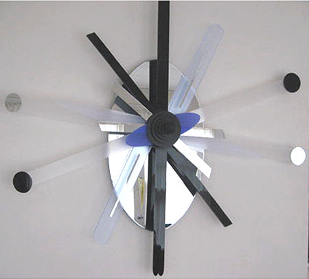
The summer a year ago I had stepped back from a somewhat futile campaign in which I had played around with wood lath. The results were fairly weak, but some directions were indicated. Then I discovered plastic with its many options. In fact, I have found that the variety of visual effects – transparencies, mirrors, colors – can resemble a candy store and I have had to restrain myself.
more… »
Posted by June Underwood on August 17th, 2009
In a few months, I’ll be back in Nevada, tackling the Amargosa Playa again. This time I want to do a set of painted panels, five 5×5 foot ones (25 horizontal feet). I have various notions of how this might work out in paint, but will have to wait until I get there to see what actually happens. I also want to do something similar in textiles, perhaps only some preliminary image making, saving stitching for when I return to Portland. But I am mulling over both projects in my mind, trying to think how I might work them.
I just read a blog entry (dated August 17) by Jenny Bowker, who is an art colleague who works in quilted textiles. She tackled the same kind of landscape and had the same kind of hopes about what she might evoke, with some additions that the Amargosa doesn’t have: the presence of a handsome driver and some marvelous land forms. Her blog entry, which finishes with the photo of her textile work, is worth reading for sheer pleasure. But it makes me somewhat nervous about my ambitions.
Here’s the photo of Jenny’s artwork, which won a prize at the Canberra quilt exhibit and, I’m sure, will be seen often at other places around the globe.

Jenny Bowker, Sandstorm over the White Desert, about life size (see her blog entry for scale)
And here is an photo or two of what I will be facing, again

more… »
Posted by June Underwood on August 10th, 2009
Some of you already know that I’ve been copying Emily Carr paintings for the last week or so, attempting to understand more fully how she does forests and trees.

Emily Carr, Cedar Sanctuary, 38 x 26″, Oil on paper, 1942
I’ve learned a lot through this exercise [ including the rule that I must paint-over or otherwise destroy the copies I’ve made before someone comes into the studio and exclaims with pleasure over them. Such an exclamation forces me to admit that what the complimenter is seeing is a copy, causing embarassment all round.] Carr’s finding of shapes in the complexity, of making color within the shapes, and of “draping” her branches are all valuable for my own art-making thoughts.
However, during this process, I had other kinds of questions occur.
more… »
Posted by Jay on June 24th, 2009
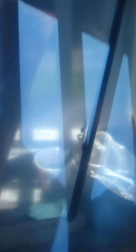
As many of you know, I have this thing for low solar angles. This is a sheet of acrylic in its protective layers that I casually placed on the back porch. It reflects little while transmitting a softened and generalized view of things beyond, including the combined image and shadow of a mop handle. The nice blue is the color of the protective material. Really, no issues to discuss – I just thought you’d like to see this.
Posted by Jay on June 21st, 2009
This touches lightly upon some of our prior discussions.
I wanted to compare an Albers “Homage To The Square” iteration to a similar, but mechanical version as rendered in Adobe Illustrator.
The Albers image was chosen because it appears that he was trying for a gradation in a single hue. I lifted from a site where it is being offered as a poster. Therefore, it may be chromatically inaccurate – but what hey.
I created a replica of the outer limits and the innermost rectilinear shape in their respective relationships. I then sampled the poster for the colors of the outermost and innermost elements and then blended the elements, calling for one interim shape.
Obviously the interim shape is at issue. The Illustrator version splits the difference in size between inner and outer, as it does the color. Not so with Albers who made the interim more imposing in size and saturation, and to my eye it looks a whole lot better.

