Posted by Jay on June 21st, 2009
This touches lightly upon some of our prior discussions.
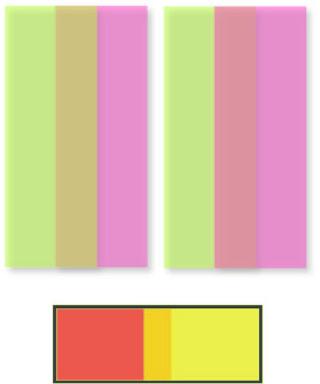
I wanted to compare an Albers “Homage To The Square” iteration to a similar, but mechanical version as rendered in Adobe Illustrator.
The Albers image was chosen because it appears that he was trying for a gradation in a single hue. I lifted from a site where it is being offered as a poster. Therefore, it may be chromatically inaccurate – but what hey.
I created a replica of the outer limits and the innermost rectilinear shape in their respective relationships. I then sampled the poster for the colors of the outermost and innermost elements and then blended the elements, calling for one interim shape.
Obviously the interim shape is at issue. The Illustrator version splits the difference in size between inner and outer, as it does the color. Not so with Albers who made the interim more imposing in size and saturation, and to my eye it looks a whole lot better.

Posted by Jay on June 4th, 2009
Bruce Marsh Commented on Josef Albers in reference a recent post on Giorgio Morandi. He presented the challenge of finding three colors that would create the sense of two colors overlapping – if I understand correctly. It made me wonder if this daunting task could be automatically solved by the computer.
I heid to my Adobe Illustrator and drew two identical rectangles. One I colored green and the other a lavendar. I rendered both 50% transparent and slid one rectangle partially over the other. This created an intermediate hue; the rectangles acting like translucent panes. I then rearranged the panes by sending one back, and where the intermediate hue had been a green over lavendar, the new effect was lavendar over green. Overdoing it, I then introduced a offset shadow effect, which created the appearance of actual translucent objects. Not done, I tried red and yellow at a greater opacity.
Would Albers – having been kept ignorant of the means employed – approved?
Posted by Jay on May 27th, 2009
This has to have come up among the copious writings surrounding Cubism, but the facet – a unit of composition often used by Picasso and Braque – can resemble a sheet of paper hung on a wall.
Signature elements include a generally rectilinear shape, a highlight and a shadow side. One can imagine a wall full of notes and sketches begging to be arranged. Makes me think of Da Vinci and his cracks.
Some of you may be shaking your heads at my ignorance of the literature. If so, please bring me up to speed.
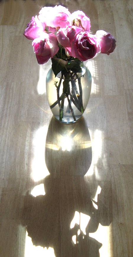
Posted by Jay on May 21st, 2009
This time of the year is special. Last spring I was taken by dappled light as it fell upon the house and the old fence. But that didn’t last as trees were felled and the fence was replaced by something smooth, implacable and untouched by time. But the setting sun remains to cast a languid glow over the kitchen table.

What is your favorite time of the year?
Posted by Jay on April 27th, 2009
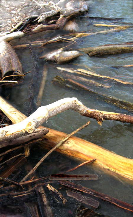
Whiskey Island, during Prohibition, was a dropping-off point for bootleg from Canada. Those glory days well in the past, the Island, in its backwaters, now tends to collect floating debris. I took this shot over the weekend.
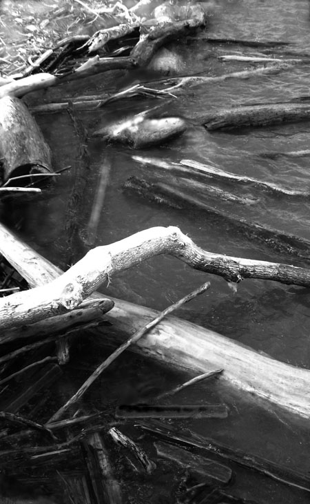
Some time ago, as part of a dialogue with Steve concerning waterfalls, I had reworked an image of a shallow stream stepping over a flat and rocky bed. In touching up the visual I had entered a mild state of flow in which I was aware of my surroundings, but so deeply engrossed in an emerging pattern of alterations that it seemed I was mapping my own mental landscape. Here again I encountered something similar. Time seemed to go away and I lifted my eyes from the screen to find it well past my bedtime. It was a lovely floating experience.
Do you lose track of time when engrossed in your work?
Posted by Jay on April 9th, 2009
Until I can get it through my head how to place images in comments I’ll have to post.
I found a jar and it says: Utrecht Linens Iridescent Silver. Otherwise Iridescent Gold. The ingredients label mentions coated mica, which I understand involves an application of titanium.
For Birgit here’s a closeup of that house:
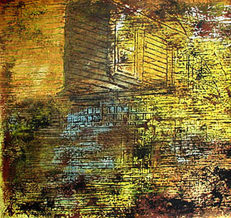
I dug around, looking for ways that the gold had been applied.
more… »
Posted by Jay on April 7th, 2009
Karl recently asked if gold still has a place in art. Frank Lloyd Wright thought it did in architecture and tried to persuade the Kaufmann’s to gild Fallingwater. It would have been something to see, but a headache all around.
Out of curiosity I introduced some gold effects into a stock image of Fallingwater.
The gold is straight out of a jar. Utrecht Linens sells a water based gold luster that goes on like paint. In this case I mixed it with clear medium, allowing a bit of under painting to come through. the theme of the image dictated that forms and colors be simplified, although I can imagine something more complicated working as well.
more… »